User:David Regev/Ubiquitous Firefox
This page was turned into a series of guests posts for Mozilla Labs.
| Ubiquitous Firefox |
|---|
What would browsers look like if they were first designed today? Like Descartes, I’d like to purge our assumptions and start from scratch, basing ourselves not on browser design from the ’90s but on how people actually use the Web today and will in the foreseeable future.
The design will start with a few First Principles:
- Administrative debris bad; content good. This is the guiding principle behind this entire endeavour. It will allow us to design a browser where valuable space is not wasted on chrome and administrative debris but, instead, is devoted to content. Content will now have a chance to be its own interface.
- Ubiquity. Mozilla Labs’ Ubiquity (see this introductory video) should be the primary mechanism by which the system is controlled. The arguments for this are many, but needn’t be repeated here.
- Tabs. The tab bar is one of the most popular features of modern browsers. Although tabs are arguably administrative debris, I believe that keeping them for now will allow us to create a browser that is not too foreign for people (unlike my ZUI mockup). At the very end, I will revisit this issue briefly.
With our First Principles at hand, we can now design a truly modern browser, starting with a clean slate and restoring browsing functionality step-by-step.
Step 0: The Browser Template
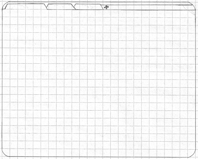
Stripping all UI from the browser, other than tabs, we are left with this debris-less window. This shall serve as the template on top of which features will be re-added in the following steps.
Step 1: Integrate Ubiquity
1a: Ubiquitize all commands
All commands that Firefox includes should be available through Ubiquity. The interface for each of those commands will have to be redesigned to be more Ubiquity-like (or “Ubiquitous”). This will require someone to take on the arduous task of designing each of these new commands until all previous commands have been replaced.
If and when this task will be needed, I am available to assist with this undertaking.
1b: Reuse the Alt key
The Ubiquity hotkey is currently Ctrl+Space. This has two problems: it’s a bit complex, and the dialogue it invokes is modal. Now that we’ve replaced the menu bar with Ubiquity commands, the Alt key is free for invoking Ubiquity instead. Not only is this a simpler hotkey, thus solving the complexity problem, but it is also easy to hold while typing (or mousing). It can be used quasimodally, where the Ubiquity dialogue appears only as long as Alt is held, thus solving the modality problem. A modal version of the dialogue can be kept and assigned Alt, Alt as a hotkey.
1c: The Firefox Button
Since Ubiquity will be the principle mechanism of accessing Firefox’s commands, it must be more discoverable. There are several ways of accomplishing this task, each one necessary. The first enhancement is to provide a dedicated button in the interface for invoking Ubiquity.
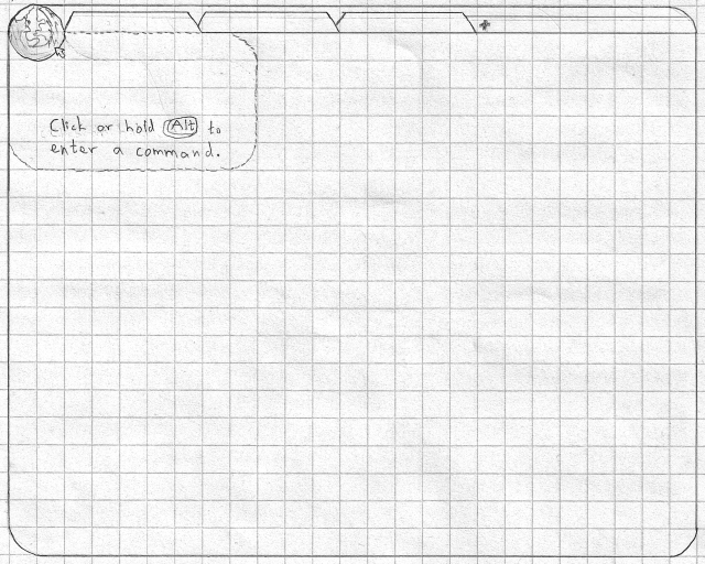
Clicking on the Firefox button brings up Ubiquity modally. The astute will notice a similarity to Microsoft Office’s Office Button: a single large button representing the entire application and providing access to functionality. The Firefox button, however, comes with several usability enhancements:
- This is the only real button in the entire interface. Thus, if a new user is trying to figure out what to do, it will be relatively difficult to miss the one and only button displayed—the unusually large one with the Firefox icon in the corner. Eliminating the choice between this button and any other is a big win due to Hick’s Law, reducing the time required to acquire the button and improving its discoverability.
- In order to make it more obvious that the logo is clickable, the button will light up and pulse whenever the mouse cursor is moving in its direction. Users will, thus, quickly discover that the button wants them to come closer.
- Ubiquity hints. Whenever the cursor is hovering over anything that will invoke some sort of command, a transient transparent Ubiquity dialogue (indicated by the dotted outline in the above mockup) will appear. It will show the command that would be run upon clicking the object. In the above example, the cursor is hovering over the Firefox button itself, so no command hint is given. Instead, crucial information is given in order to teach the user about invoking Ubiquity in the future. Generally, clicking on the Firefox button (or holding
Alt) will transform a Ubiquity hint into a standard Ubiquity dialogue.
Note how Ubiquity hints build upon earlier steps: these hints can be shown for every command because all commands have been Ubiquitized. This work will allow us to extend the Firefox interface later and add elements while retaining the Ubiquity interaction model and its richness.
Step 2: Replace the Location Bar
The location bar is arguably the most important piece of administrative debris in every popular browser since the beginning of the Web. One could argue that Ubiquity should be integrated into the location bar (such as with Taskfox), instead of using the Firefox button. However, the traditional location bar has numerous problems that make its interaction paradigm not ideal. Due to these issues, I believe that we must find an alternative to the location bar.
What are the problems with the traditional location bar?
- It’s modal. First introduced in NCSA Mosaic (as far as I can tell), the location bar was a clever innovation. It combined two separate functions into one: displaying the location of the current page, and accepting commands to change the current location. This reduced the number of similar-looking widgets into one unified concept. Unfortunately, this introduced two modes: a status mode, and an editing mode. In status mode, the current page’s location is displayed; in editing mode, whatever the user has recently typed is displayed. Thus, when the location text has been edited, it ceases to display the current location, and does not update as the page location changes. The user must keep the current mode in mind in order to avoid misinterpreting the location bar text. Otherwise, mode errors may occur. Moreover, when in editing mode, there is no way to recall the current location definitively without resetting the location bar, thus losing whatever the user had edited up to the point.
- It’s unreadable. URLs were not designed to be readable by normal humans. In fact, the first web browser, WorldWideWeb, did not expose them to the user. Even today, people don’t read URLs. Unfortunately, we are stuck with this aspect of the Web for now. we must, therefore, make URLs more human-readable in some other way: present them in a modified form that people are more likely to read and comprehend. There have been attempts in the past to display a breadcrumb trail in Firefox’s location bar. These efforts have not yet been fruitful, partly due to the location bar’s modality: as soon as the mode changes from status mode to editing mode, text jumps around and the location bar’s contents change dramatically. This breaks the conceptual unity that the location bar was supposed to allow in the first place. Finally, even with a breadcrumb trail, the location bar does a poor job of indicating its purpose to average users. It is unlabelled, it is disconnected from the page it is describing, and it looks more like a place for code than a status display, due to being an editable text field rather than something like the status bar. In short, its usage is not discoverable enough and can actually scare users away from discovery.
- It’s always visible. In Desktop browsers, the location bar is always visible—but it is not always useful. It is needed when the user wants to know the current location or to change it manually. Most of the time, however, it is a waste of valuable screen real estate—space that could have been devoted to content. In other words, the location bar is clutter and administrative debris.
- It’s optimized for one command. Just as the location bar was designed to display only one type of status, the URL, it was designed to process only one type of command, ‘take me to this URL’. Over time, the editing mode has been expanded to allow entering page titles and web searches and to display various widgets. Due to clashes with the location bar’s traditional design, progress in adding more and more command-like functionality has been slow. For example: Should the location bar display the current location or the command used to get there? When calling a command on a selection, does it make sense to display it all in the location bar, which conceptually relates more to the page as a whole (and its location)? When the user has built a complex command but has not yet run it, what should be displayed if the focus changes or if the user navigates elsewhere? These are some of the questions raised. Finally, due to its shape, the location bar has gotten more cluttered as more informative widgets have been added to it (Identity button, feed icon, bookmark star, and items added by extensions). Due to space constraints, it is difficult to transform this clutter into clear information design, especially when this design has to accommodate two modes.
All these issues point back to one point: the dual-mode paradigm of the location bar is a barrier to progress. The solution is to separate the two modes and evolve the interface from there. This means that the interface for displaying page status should be separate from the one for running commands (including the command for navigating to a page).
2a: The browse Command
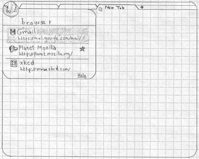
The Ubiquity replacement for the editing mode of the location bar is the ‘browse’ command. Calling this command yields the same suggestions as for Firefox’s “AwesomeBar”, integrated into Ubiquity’s suggestions. In order for this command (and Ubiquity in general) to be as discoverable as the location bar, new tabs will bring up Ubiquity automatically (modally), with browse pre-filled. Switching tabs will dismiss it, while switching back to the new tab will bring it back. Essentially, the dialogue “lives” in new tabs.
2b: Display Page Info Inline
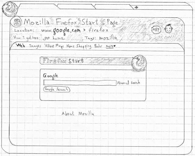
The next step is to move the status mode of the location bar into the content area, attached to the page. Like with mobile browsers, the page info moves with its page, thus disappearing off the top as the user scrolls down. This will allow one to focus on content, without distraction. Since the page info can be scrolled away, its new design can take up more space than the location bar, allowing better information design. The page info area is also a prime target for enhancement by extensions. In the following mockup, for example, Adblock Plus and Greasemonkey are both running on the page. Moreover, since Ubiquity is now integrated and commands are now a common means of navigation (hopefully), it makes sense to display the method used to get to a specific page. This will reinforce the learnability of the commands. Finally, all the metadata that were previously available in the Page Info dialogue can now be called here and displayed inline—all without getting in the way of content.
2c: Edit URLs Easily with Ubiquity Hints
One of the benefits of the location bar’s modality is that the current URL is very easy to modify. How to do so easily within the proposed interaction paradigm is not immediately obvious. With our previous introduction of Ubiquity hints (step 1c), however, this problem is solved. Pointing at anything that will run a command when clicked on will bring up a hint—a transparent preview of the command that will be run. Thus, such hints will appear when pointing at links, whether in content or in the page info area. Editing that command (and the URL) is as easy as hitting the hotkey. Therefore, it is now simple to edit not just the current page’s location but that of any link, in addition to any other command that is exposed in the interface.
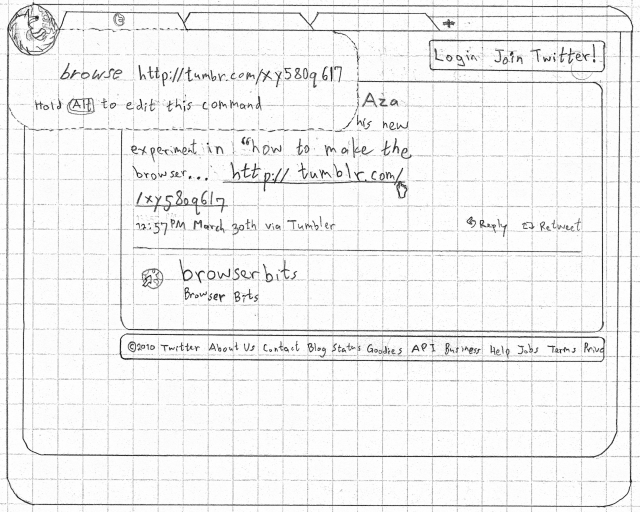
Once this system of Ubiquity hints is in place, the way in which users are taught functionality is greatly improved. It is now possible to add commands and to expand the capabilities of existing commands without significantly contributing to bloat. Commands can now be more discoverable: point to one and you’ve practically learned it.
Once this is exposed to individual sites, the rest of the Web may take advantage of Ubiquity, leading to more debris-less design. For example, say I’m using Gmail. I point to a button on Gmail’s text-editing toolbar, and a transparent hint pops up, telling me that that button will run the ‘bold this’ command. From now on, I know exactly how to make text bold without needing to switch to my mouse or to memorize a keyboard shortcut. If I install that command from Gmail, I now have access to this feature anywhere.
Step 3: Rethink Back/Forward
The Back and Forward functions have been standard in web browsers since the beginning. These functions are a necessary aspect of the current standard browsing model: follow a link and it is loaded in-place, replacing the previous page wholly. If we are to rethink the Back and Forward buttons, we must also reconsider the standard browsing model. It is not difficult to see a number of problems with this model. Listing these problems will help us come up with a better, more modern, model.
What are the problems with the standard Back/Forward model?
- The Back/Forward buttons are administrative debris. Most of the time, the Back and Forward buttons go completely unused. Thy convey little information, take up valuable vertical real estate, and detract from actual content.
- It hides your trail. Whenever you follow a link, the page you’re on simply disappears. Poof! and a new one magically takes its place. There is no visual indication of what is happening, no attempt at information design at all. The best you have is a bare-bones list of page titles completely hidden behind the Back/Forward drop-down.
- The Forward “history” is mutable. Whereas the Back button’s history is reliable and doesn’t change, the Forward button’s history is not immutable. If you go back three pages and follow a link, the three pages that were previously part of the tab’s Forward history are now gone, replaced by the new page. One might have expected that the new page would have been inserted into the history in that place, or at least appended to the list at the end, but it’s not. Your browsing history for that tab is now incomplete. The only way to revisit a lost page is to dig through your browsing history, using an interface that preserves context even less, and hope you find it.
- It is one-dimensional. Related to the previous issue, a browsing session can seldom be represented by a linear list. Modern tabbed browsing is more often a two-dimensional tree (as demonstrated by xkcd, and explored in my ZUI mockup). The way browsing history is handled, thus, conforms more to browsing as it was when browsers were first introduced rather than to how it is today.
- Page transitions are awkward. Click on a link. What happens? In an ideal world, I suppose, the new page would simply be rendered immediately. In the real world, and for the foreseeable future, the new page takes time to load. What happens in between? The previous page remains displayed for a bit, but it is only partially active. Interacting with the page, such as by clicking on objects or by scrolling, is hit-or-miss and unpredictable. At some unpredictable point during the transition, the page completely disappears, and the new page starts loading. No matter how short or long this transition is, one thing is certain about it: it wastes time. During this wasted time, the browser is mostly useless and the user’s train of thought is put on hold, at risk of being lost altogether.
- Tabbed-browsing power users are familiar with a workaround: middle-click on links instead. Doing so opens the new page in a background tab, allowing that page to load ahead of time while the user continues to read the current page without interruption and without the page becoming unresponsive. Transitioning to the new page is then a simple matter of closing the old tab and reading the new one immediately, avoiding any wait at all. This is still, however, a workaround. It can also lead to an increase in the number of tabs open.
- Revisits are unpredictable. Go back a few pages. What happens? If you’re lucky, the intended page loads without delay and looks exactly as you remember it. If you’re unlucky, the page will reload, forcing you to wait. If you’re really unlucky, the page won’t load at all, but you will instead see a scary and unhelpful dialogue about ‘POSTDATA’.
- Tabbed-browsing power users have a workaround here as well: if you think you might need to refer back to a page, leave it open in another tab. This eliminates the upredictability of going back to that page, as it’s simply a matter of switching tabs. This does, however, contribute to tab proliferation. It also requires one to think longer before closing a tab, thus diverting more valuable time towards tab management.
Can we solve all of these problems with one redesign? Yes!
3a: Inline Tab History
In step 2b, the tab was transformed from a proxy for its current page into a container for that page. The next logical step is to allow that container to contain more than one object; instead of just the current page, it could contain all pages in its history.
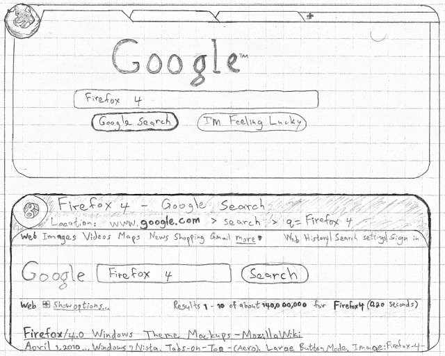
In the mockup, the user has just clicked on ‘Google Search’. Instead of the page becoming unusable and morphing into a new page, the view scrolls as the new page slides into view while loading. In the mockup, the new page is in the process of scrolling into view. If the user wished, this automatic scroll can be interrupted by manually scrolling (either by mouse or by keyboard). Switching back and forth between pages in the tab’s history is now greatly simplified: just scroll up or down. In this more visual representation of history, what you see is what you get; going back to a page displays it exactly as it was, completely predictably. The darker border indicates the currently-focused page. Only that page is active. When the previous page lost focus, its state was frozen and saved. An unread page in the Forward history, however, gets loaded in the background fully and then frozen until the user chooses to view it. Scrolling up a little more or clicking on the previous page slides it back into focus. Its state is then restored and the later page is frozen and saved.
The big advantage of arranging pages vertically instead of horizontally is that it unifies two motions: moving through the page, and moving through history. Essentially, the tab now represents not one page unit but a browsing timeline. The vertical position now represents not just a point on a page but a point in time. Much of this was inspired by Google Reader’s “River of News” interface and, to a lesser extent, Gmail’s conversation view.
This is still not a complete solution. Not all of the problems are satisfactorily solved. Moreover, we’ve created a new one: how do you quickly navigate back to a specific page from a while ago? Finally, there is another form of administrative debris that I’ve been neglecting: the scrollbar. Shouldn’t it be there, or at least be replaced by something better? The next step will answer these questions with one solution.
3b: The History Scroller
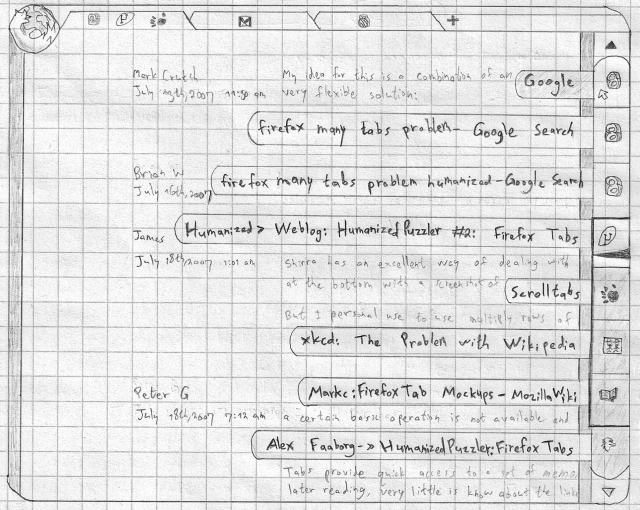
The History Scroller is a modern cognate of the traditional Back/Forward drop-down list. Instead of hiding behind administrative debris, it is designed to be visually present and visually informative. It also replaces the (vertical) scrollbar.
How does it work?
- The Scroller displays the favicons for the current page and for several pages before and after it in the history. This allows quick access to the pages one is most likely to (re)visit.
- Clicking on the arrow either at the top of or at the bottom of the Scroller slides the rest of the history down or up, respectively, into view.
- Hovering over any history item displays an overlay of the titles of all history items. This saves time, as one need not check each item one at a time in order to examine its tooltip. This also saves space, as all those titles do not need to be displayed at all times.
- Clicking on a history item causes the content area to scroll smoothly very quickly, bringing that page into view. The user’s previous position on that page is restored, as page position is always remembered. This position is stored whenever the user “parks” at a particular point. Thus, scrolling from one page to another does not alter the stored location for the previous page.
- The history item for the current page additionally contains a tick that indicates the position within the page. The tick may be repositioned manually within the page by clicking on the desired position (not by dragging). Coupled with the scrolling mechanisms of mice and touchpads, the traditional scrollbar is now obsolete.
- The tab on top, no longer a proxy for an individual page but a container for a chronological sequence of pages, displays the favicons of the current page and the two surrounding pages. The tab is now a reminder not only of the site being viewed within it but of the context as well.
Much of this interaction model was inspired by Bret Victor’s Scrolltabs demo, which was proposed as a different solution to the ‘too many tabs’ problem. The way tabs display three favicons instead of a page title will allow tabs to take up less space on the tab bar and will, therefore, free up space for more tabs. This extra space, however, will not be needed as much, as the next step will dramatically decrease the need for too many tabs in the first place. The final interaction aspect of the History Scroller will present its own solution to the ‘too many tabs’ problem.
3c: Solving the ‘Too Many Tabs’ Problem
Where do tabs come from? They are either created from scratch manually (via the New Tab command or button), or spawned from another tab. Which way causes the most tabs? By far, it is the latter. All those tabs together can always be traced back to one Ur-tab—the root node in a branching tree of pages. If each of these trees could be contained within one tab, the number of tabs would fall drastically. The ‘too many tabs’ problem would disappear.
But how? Consider the specifics of the History Scroller in the mockup:
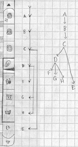
When one traverses one of these tab trees, there is usually a predictable and liner order in which the page at each node is read. This is the depth-first order (which is arguably more efficient than a breadth-first order). Such a flow was boosted by Firefox 3.6 when spawned tabs were made to appear adjacent to their parent and in order. What if we simply collapsed the tree into a single dimension, preserving its natural reading order? This is exactly what the diagram shows.
So, how does it work? These are the rest of its features:
- Forward history never disappears. Clicking on a link creates a new history item between the current page’s item and the next one in the history.
- Middle-clicking on links no longer spawns new tabs. The same goes for new tabs spawned forcibly by web pages. Instead, the new page is inserted into the history without the content area scrolling to that page automatically. This is the functional equivalent of clicking on a link and quickly scrolling up a little. This allows the user to continue reading the current page until the end, at which point the unread page will be immediately available.
- Such unread pages are distinguished visually. This is indicated by the darker background of unread history items in the mockup. The History Scroller’s persistent visibility allows this to be feasible, since all this information is no longer hidden behind the Back/Forward drop-down.
- If more than one background page are spawned, they get added in the order in which they were opened.
- The current page and all pages opened from it in the background form the active page group. This is visually styled in the History Scroller. In the mockup, this is indicated by the darker border around the four items in the active page group.
- History items may be rearranged. This allows the user to make sure that pages are arranged in reading order.
- History items may be dragged out of the Scroller and into the tab bar and, thus, converted into tabs.
- History items may be deleted. At the very end of the tab’s content, after the last page in the history, a list of deleted pages is provided. Pages may be restored from there.
- Closing tabs is like archiving conversations in Gmail. Those tabs may be viewed or restored in their entirety at any point. Firefox’s History always displays pages in their original context, with a tab’s history. Thumbnails are also stored for each closed page.
- The History Scroller automatically hides when maximized/full-screen on small screens, so as not to take away room from content. It may be brought into view by moving the pointer to the right edge of the screen (in mousing environments) or by swiping the page to the left (in touch environments).
Step 4: App Tabs, Find, and Downloads
4a: App Tabs
App Tabs can be viewed as a partial replacement for the Bookmarks Toolbar. Since this feature is already being integrated into Firefox proper, there is no need to extol its virtues here. I do, however, need to explain how app tabs relate to our reimagined tabs.
Consider the archetypal web application: Gmail. Gmail is designed such that following links in the interface modify the display in-place. Repeating the entire interface in a new page below the current one would not make sense. In fact, it would be detrimental to Gmail’s usability. Besides, Gmail’s links typically modify only the page’s anchor, not the rest of the URL. Normally, in our redesign, following a link to an anchor causes the content area to scroll to that point in that page. In Gmail, however, it modifies Gmail’s own content area. Gmail also has its own navigation system, such that the traditional Back and Forward buttons are not necessary. Finally, Gmail is designed such that it is generally left open for long periods of time. Following external links, therefore, should not deactivate Gmail’s interface.
Using Gmail as an archetype, the following rules apply:
- No History Scroller. Internal links always open in-place, like they already do in standard Firefox. Navigation is dealt with by the app, though the standard Back and Forward commands remain available through Ubiquity.
- External links (outside the application) open in a new tab. This is a singular tab that collects all external links from that application. That tab is placed directly to the right of the app tab and is visually attached to it.
- The app tab shows only one favicon on top, and appears narrower than other tabs.
Sites that do not require such an interaction model need not be pinned as app tabs.
4b: Revamp Find
In order to keep Firefox’s interface monotonous, Ubiquity should be the sole way of executing commands via the keyboard. Keyboard shortcuts, therefore, should be eliminated. A well-tuned instance of Ubiquity can replace these shortcuts in an efficient—and more humane—manner. The Ctrl key is now free for another function: quasimodal Find (similar to LEAP. (It may prove better, however, to switch the usage of the Alt and Ctrl keys.)
Showing a tab’s entire history inline provides a nice benefit to how Find works: once Find has finished searching through the current page, it can move down to the next one. Thus, it will be easy to find anything within the tab’s entire history. Moreover, text should be indexed when a tab is closed (in addition to thumbnails), allowing closed tabs to be searched and restored in the future.
There are many other improvements that Find requires. They are, however, mostly orthogonal to the current discussion. To see more ideas on how I think Find could be improved, see my ‘Firefox Search, Revamped’ (which is written for Firefox’s current interface, but can easily be modified for this proposal).
4c: Inline Downloads
Downloads always open in the background in-place, in the content area—like any other page. They may be moved via drag-and-drop, just as other pages may be saved. They may also be renamed, even when downloading.
Step 5: The Future
Both the tab bar and History Scroller are, technically, administrative debris. Nonetheless, they are both intimately tied to the content and are more information-rich than all the debris that we have managed to eliminate. The tab bar, in particular, has proven itself as the killer feature of modern browsers. This is why it made sense to take tabs as a given at the beginning of this exercise.
But can both these bars be eliminated? I believe that the best way to accomplish this is to replace one or both of the bars by zooming. Zooming out can allow one to see an overview of the content that is normally represented in either bar. This opens up three separate possibilities for a zooming interface:
- Keep the tab bar. However, instead of a History Scroller, show all that information by zooming out of the current view. As you zoom out, the content area quickly shrinks in size, turning the sequence of pages into a display similar to the History Scroller.
- Keep the History Scroller. Instead of a tab bar, show different tabs as windows arranged on a plane. Zooming out reveals these tabs. When zoomed out, a tab may be selected or moved around the plane. This approach (without the History Scroller) is basically that taken by Firefox Panorama (né Tab Candy). (The tab bar, though, was kept in the end.)
- Merge the zooming interaction for both dimensions into one, such that neither bar is needed any longer. This is arguably better than the first possibility. Like so:
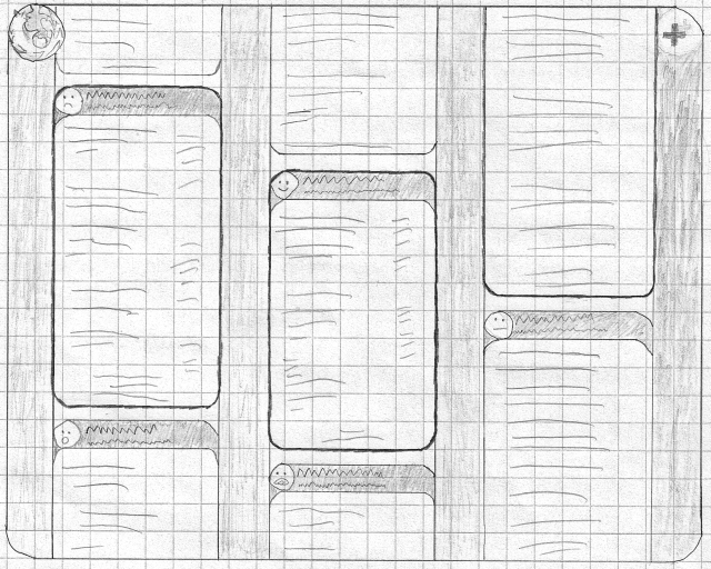
Zooming out shows each tab/history next to each other. The canvas may be zoomed out even further, such that all that is visible is columns of favicons. From this perspective, each column tends to move independently from the others, as scrolling within a tab moves its content but not the entire canvas. When zoomed out, only the current active page in each tab remains active. Choosing another page zooms the viewport onto that “tab” while simultaneously scrolling that column to line up with the active area of the other columns. This ensures that the active pages from each tab are always near each other.
My preferred direction is to integrate with Panorama. The History Scroller and Panorama compliment each other. The former deals with the ‘too many tabs’ problem by minimizing the number of tabs needed to be open at once, while the latter makes the interface for dealing with many tabs more efficient and useful. Similarly, the former is an attempt to present a better interface for a tab’s history, while the latter presents a better interface for tabs.
Ideas on how to integrate the two ideas are welcome.
How would you redesign the browser?
I am thinking of creating some better mockups of how the History Scroller would fit into the current Firefox design (independent of Ubiquity). Beyond that, a live mockup needs to be created, eventually leading to a working extension. If you’re interested in helping in any of that (especially the live mockup), please contact me.