User:David Regev/Firefox ZUI
The Problem
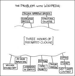
For several years now, people have been aware of the ‘too many tabs’ problem in Firefox (and other browsers). I first started thinking about possible solutions when the issue was discussed on the Humanized weblog. Many insightful comments were made there, but the following solution did not hit me until a reference was made to a certain XKCD strip (pictured at right). It then hit me that XKCD did better job of visualizing the user’s mental model than most browsers were doing. If Firefox were redesigned as a ZUI (à la this demo), there would be a mode direct mapping of the mental model to the interface while the ‘too many tabs’ problem would be solved as well.
A Solution: ZUIs
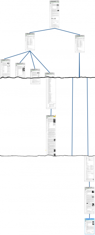
The following is a partial mock-up of how the browsing session depicted by XKCD could appear in a ZUI.

- All web content is laid out on a plane. This plane contains not only the current “open” pages but one’s entire browsing history. Pages appear in full, without scrollbars, arranged in a manner akin to a mind map. Each page is a node in a tree, with pages that were opened from scratch placed as the root node. Navigation is accomplished by zooming and panning. The vertical position of the top of a page represents the time that page was opened relative to surrounding pages.
- There is no distinction between the standard browsing interface and a separate interface for viewing history and bookmarks. There is no concept of ‘opening’ and ‘closing’ pages. Instead, one creates nodes in the tree and leaves them there when done with them. One could, however, remove a node, thus permanently removing it from the history. History items are always displayed in context, exactly where they first appeared.
- Information that was previously concealed, which the user had to keep in memory (the mental model), in now clearly displayed. The width of the plane shows breadth, thus exposing the previously-hidden relationship between spawned tabs and their parents. The height of the plane shows depth, exposing the timeline that used to be hidden behind the Back button. Since the tree branches out vertically, rather than horizontally, a page’s inherent temporal organization (that it is read top-to-bottom) lines up with the whole tree. Thus, when one finishes reading a parent node, one can easily continue downwards to its child nodes.
- Tabs no longer exist. Therefore, middle-clicking on links is remapped to ‘open a new node but don’t pan to it yet’. This functionality allows one to create multiple branches and then to navigate them in a more logical depth-first fashion. When one reaches the end of a branch, a ‘Next’ button is placed as a final node. Activating this button causes the interface to zoom out, pan, and zoom in quickly on the next logical node (in a depth-first order).
- All sorts of metadata can be displayed inline in the environment: read/unread (‘unread’ here refers to a page that has not yet been viewed at 100% zoom), statistics, bookmarks, tags, URLs, favicons, etc.. ‘Flagpoles’ may be placed on the plane to bookmark specific spots. Similarly, indicators are automatically placed next to pages where one left off when leaving a page before getting to the end. Additionally, Pages may also be resized and sibling nodes may be rearranged horizontally. All this creates a more information-rich display.
- A zoomed-out version of the environment is not identical to a scale version of the zoomed-in version. Rather, semantic zooming is employed, where the display is changed per zoom level in order to convey information more efficiently. Thus, for example, page titles and favicons zoom out less quickly then page content, headings zoom out more slowly then paragraphs, and less important elements disappear when zoomed out far enough.
- Search in now universal. A find-as-you-type search works not only within the current page but in progressively more global ranges, moving from the current node to the entire branch, to the entire tree, and eventually to the entire browsing history. Additionally, the display can be filtered to display only pages with particular search terms or metadata (such as only bookmarked pages).
- When old pages are revisited, they are copied at the bottom of the environment and refreshed. “Live” pages, such as web applications, will require special treatment so as not to fall too far out of view. There are several possible ways to resolve this problem, but it is sufficient here to note the the issue would require discussion.
- Back/Forward can be redefined to keep track of visited points on the map, allowing quick jumping between views. Additionally, extra viewports may be created so that multiple views can be displayed simultaneously.
Conclusion
Although I am not sure that this is the ideal browsing interface for the modern web, I believe it reveals many insights about how we actually browse. Browsing in no longer one-dimensional and linear. It has become two-dimensional, thanks to tabs and their ease of creation. Nonetheless, the current tab implementations do a poor job of representing this two-dimensionality and the user’s mental model and, worse, of helping the user keep track of information. This is one suggestion for improvement, but there could easily be others.
Prior Art
- MosaicG WWW Graphic History Browser. This is not a zoomable interface, but a display of browsing history as a horizontally-branching tree.
- A Zooming Web Browser. Unlike my proposal, this browsing ZUI branches out horizontally. I believe that this is less efficient, as it breaks the natural top-down flow of reading. Also see Graphical Multiscale Web Histories: A Study of PadPrints.
- AutoBAHN: Automatic Bookmark and History Navigator. This interface looks quite promising as an alternative zooming interface. In some ways, it is similar to Tree-Style Tab. The interested reader is advised to follow the link. Also see Domain Name Based Visualization of Web Histories in a Zoomable User Interface.
- WebPath: A 3-D Browsing History Visualisation. Unlike ZUIs, this interface is 3-dimensional. There is a certain logic to this, as time is technically separate from the two spatial dimensions of web pages. In practice, however, I believe that collapsing time and one of the spatial dimensions (specifically the vertical) into one yields a less confusing and more efficient interface.
- MacWarriors TrailBlazer. Similar to example #1.
