User:Broccauley/Firefox Menu Explorations/Archive
This is an archive of my older ideas from July/August 2010 that was originally located on the Windows Theme Mockups Discussion page. My newer favourite ideas can be found here.
Contents
Office 2010 style Menu button
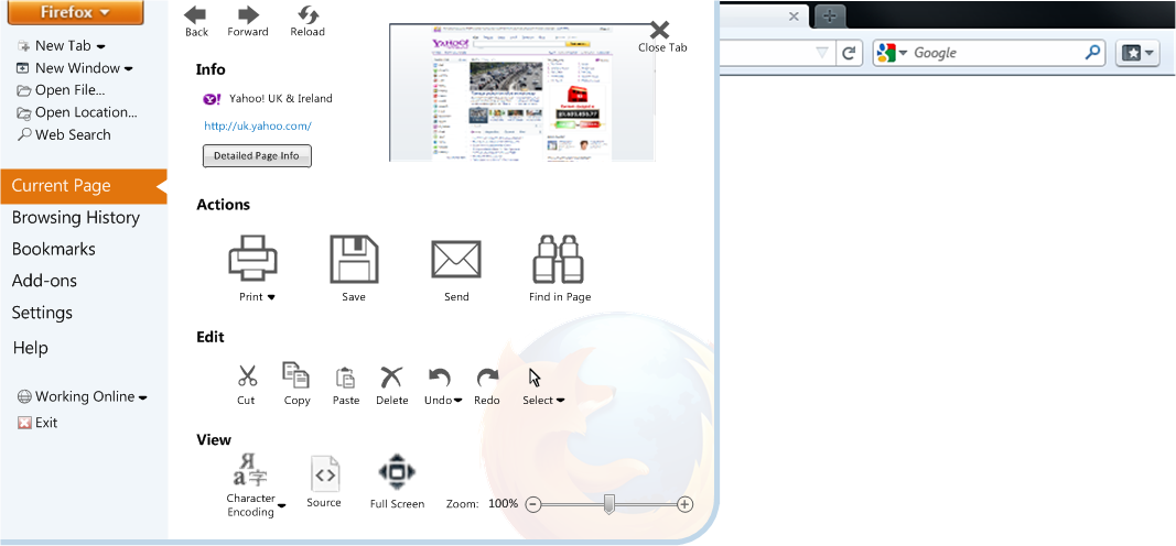 This mock-up is based on the MS Office 2010 'File' button and 'backstage view, albeit with some conceptual differences. A major concept used here is a clear separation between global menu options and menu options that only apply to the current page. The menu also does not occupy the full screen like the Office version. Another advantage of a menu like this is that the same number of clicks are required as for the old menu bar, except with the added benefit of larger click targets. A major philosophy for this mock-up is that *all* possible menu options that were previously available in the menu bar are to be in this menu.
Some details:
- All options also are to have a text label - this aids new very novice users with the functions and their iconography.
-Pressing Alt should also bring up this menu and show the keyboard shortcuts to access every option (as Office 2010 - this accelerates the learning of keyboard shortcuts.
- The drop-down beside the new tab/new window is to also show the option of a new private tab/window.
- The back/forward/reload/stop buttons in the Current Page view are present to allow certain minimalist web applications to still have these controls. They are also present for the previously mentioned reason that all functionality should be available within this menu and for teaching novice users iconagraphy etc.
- The Info section of the Current Page view allows an area to show the full page title.
- The icons in the Actions section is large as almost all users would expect to access such options through a menu interface.
- Personally I would not use the Edit section, but again it is there for completeness. All menu items should be configurable for this reason - either in the settings, or show carets (visible only on mouse-over to reduce clutter) to show/hide individual sections on demand (not shown in mockup).
- The 'Browsing History' view will show the recently closed tabs, full history, download history, and give options for clearing/cleaning the recent history.
- Add-ons menu can show the contents of the new add-ons manager tab here. (I do not like the idea that I've seen discussed to have application options shown in tabs - IMO tabs should only be for web content/documents and all options could be integrated in a menu like this).
- The settings view will show the main preference options and personalisation options. It will also allow the import/export of settings/bookmarks and sync options. Bookmark import/export could also be shown under the Bookmarks view.
- Help will show the main help, About Firefox, updates etc.
Broccauley 12:32, 19 July 2010 (UTC)
Philosophy not to duplicate existing obvious functionality
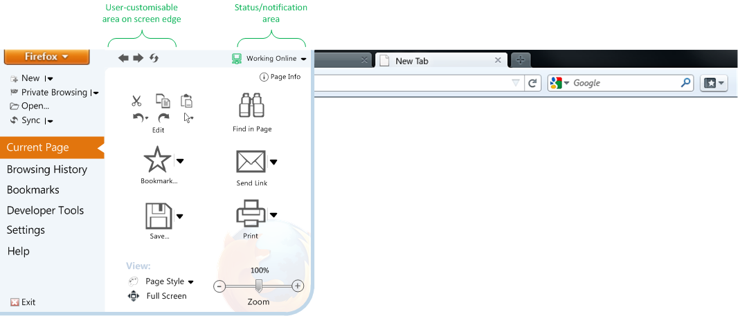
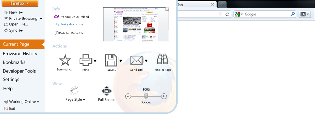
The previous mock-ups pointlessly duplicate obvious functionality that is found elsewhere in the UI (something that Microsoft has been guilty of in the past but has cleaned up in Office 2007/2010). The above mock-ups treat even the most novice user as if they are stupid. There is no need for yet another set of navigation controls and the edit options which are easily accessible by right-clicking. Therefore, here is a more minimal version:
 Broccauley 14:47, 19 July 2010 (UTC)
Most Minimal Office 2010 Design
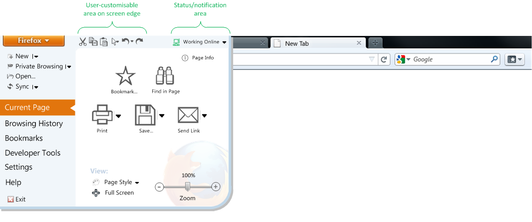
Here is a variant with controls on the top screen edge. All edit options are also here, but I'm sure that after Test Pilot surveys with this design the 'Edit' section could disappear entirely!:
Moving the Edit controls to the user-customizable area at the screen edge and a different icon arrangement:
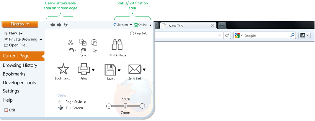
The sync status in the status/notification area and another alternative icon arrangement:
Broccauley 22:33, 21 July 2010 (UTC)
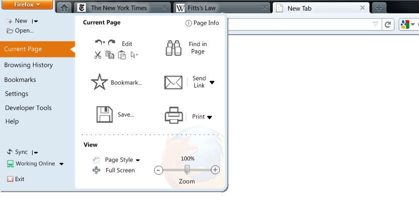
Simpler Split Matrix design, partitioned by Current Page
Here is a menu design that is more similar to the matrix design by Nawfel above. The major concept here, however, is that there is a major split between global Firefox options and options that only affect the current page (Something Google Chrome tried to do but failed). I tried to also keep note of the partitioning of the "i4" design mentioned at http://blog.mozilla.com/faaborg/2010/07/18/details-about-the-firefox-button/ to try and make it easy to transition to.
I liked the idea in the "i4" design where clicking the icon will bring up the fist option of the sub-menu (sub-menu accessed by drop-down), so I have kept it here. Some other differences here from the "i4" partitioning:
- I think 'Zoom' and 'Page Info' should be retained (not easy to find in the 'site identity block' as proposed).
- I don't think that 'character encoding' is a 'developer tool' - often I use this to view certain non-English websites. I re-instated 'Page Style' and think that character encoding should be a sub-menu of Page Style.
- There is no easy way to bookmark the current page in the "i4" design - the star on the location bar is not obvious enough!
- Downloads are found under 'History'
- I added undo/redo/select to the edit option.
- I retained the 'Work Offline', but don't care much about this.
- Extensions may choose which section to display themselves in and whether to display themselves as text or icons.
One thing that might need changed is that most of the 'Developer Tools' apply to the current page so might be more logical to move to the right-hand side.
The main advantage of this design over the "i4" are that large icons are easy to pick out with the eye and are easier mouse targets; icons may also be varied in size depending upon usage. There is also a shorter mouse distance for the most used menu options. The partitioning is also more clear and logical. It's not as easy on the eye as the last 'Office 2010' design above, however, it is an easy transition for the developers to make as history, bookmarks etc. don't have to be re-coded to work in the menu.
Broccauley 13:46, 21 July 2010 (UTC)
Small icons version:
The designs above had partitioned the options between those that affect the current page and the others. This design partitions the design between *all* page-related options (not just those that affect the *current* page) and others:
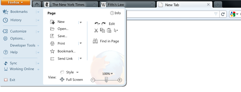
- The 'New' drop-down contains 'New Tab' (default), 'New Window', and 'New Private Window'. With this 'Page' partitioning I do not think 'Private Browsing' deserves its own dedicated menu icon.
- 'Style' contains the current FF3 View->Style options + Character Encoding. - The icon for 'Find in Page' is slightly larger than others due to Fitts's law to compensate for the larger mouse distance for this important option.
- There is no icon for 'Downloads' (read in a blog that they were to be integrated with History) but this could be added after History.
Broccauley 02:00, 23 July 2010 (UTC)
Large icon version:
The icon size could be configurable. The icons above should be the same size as those in Wordpad/Paint in Windows 7.
Another advantage of larger icons is that you can allocate a larger area to access the sub-menu:
Another configuration - Large icons on left and small on right:
![]()
with large icons:
![]() In the above case 'Open' contains 'Open New Tab', 'Open New Window', 'Open New Private Browsing Window', 'Open File...'. The 'New' option under the old File menu is an old left-over from word processors - Firefox only browses/views/opens HTML documents - it doesn't create new HTML documents so it actually never made logical sense to have a 'new' option in the first place!
In the above case 'Open' contains 'Open New Tab', 'Open New Window', 'Open New Private Browsing Window', 'Open File...'. The 'New' option under the old File menu is an old left-over from word processors - Firefox only browses/views/opens HTML documents - it doesn't create new HTML documents so it actually never made logical sense to have a 'new' option in the first place!
With user-customisable quick access toolbar:
With notification area for sync and connection status; small icons on the right:
![]() Changes to the sync/connection status could be emphasised with a large speech bubble.
Changes to the sync/connection status could be emphasised with a large speech bubble.
Broccauley 01:17, 24 July 2010 (UTC)
2-pane Office 2007 / Win7 Style
The following mock-up is of what should appear once you click the orange Firefox Menu button. It is similar to the 2-pane menu used in the "ribbon interface" in Office 2007 and Paint/Wordpad in Windows 7. It is also like an inverted Windows 7 Start menu with "jump-list" arrows:
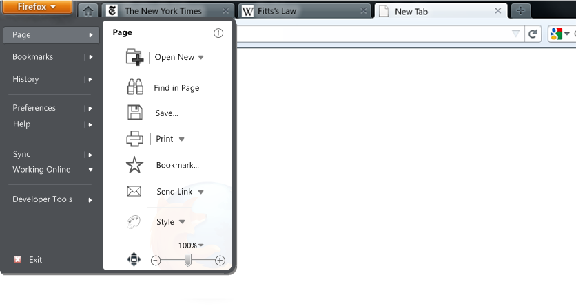 I think the analogy of the Firefox menu button being the "start menu" for the application is a good one, and hence the styling - note that the grey colour in the above mock-up is intended to be Aero glass.
This idea differs from the Win7 Wordpad menu for example in that "Page" is selected by default (in Wordpad "Recent documents" is by default, but in this case the options under "Page" are so much more important). Another difference from the Office 2007/Wordpad/Paint "ribbon interface" menus would be that the hover delay on hovering over an option in the left-hand pane would need to be longer in this case - this is because the options in the "Page" section are the most important and it would be annoying or the user to accidentally navigate away from the Page section.
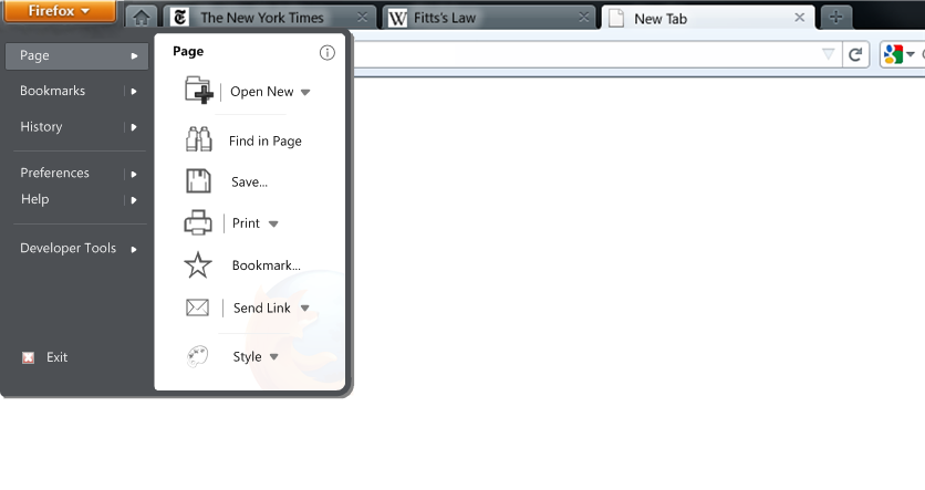
In the above mock-up the "Open New" item would contain the options "Tab", Window", "Private Window" and "From File...". "From File..." would be the same as the old "Open.." option under the File menu. I think it is logical to merge the "open" and "new" items like this as these old File-menu options are a relic from word processors - a web browser doesn't actually create "new" HTML documents, it only opens existing HTML documents!!
Clicking the icon of the "Open New" option would perform the default action ("Open New Tab"), but the user should also be able to configure the default action for each drop-down menu item. Actually, it might be more logical to put "Open New Window" as the default here as "Open New Tab" is already exposed in the main UI (though having said that, it is easy to open a new window from the Windows OS). Heavy porn surfers could of course put "Open New Private Window" as the default ;).
The "Style" option contains the old View->Style menu and Character Encoding (Character Encoding is NOT a "Developer Tool" IMO).
The "Bookmark..." option might be better as a drop-down to allow the "Bookmark all tabs..." option. Also not shown is a "Subscribe" option which would be context-sensitive.
The "Preferences" section would contain all the customisation settings, as well as the "Options..." dialogue (default).
Compared to previous mock-ups I removed the icons from the left-hand side - this I think was a good move as reduces visual noise.
The following mock-up shows what it would look like if you hovered over "History", or clicked the right-arrow beside "History":
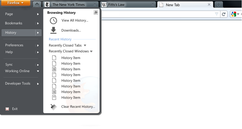 Clicking on the word "History" in the left-hand pane itself would perform the first action on the list ("View All History...")
Clicking on the icon in the top-right will pin the History to the Sidebar (as in IE8).
The following mock-up shows what it would look like if you hovered over "Bookmarks", or clicked the right-arrow beside "Bookmarks":
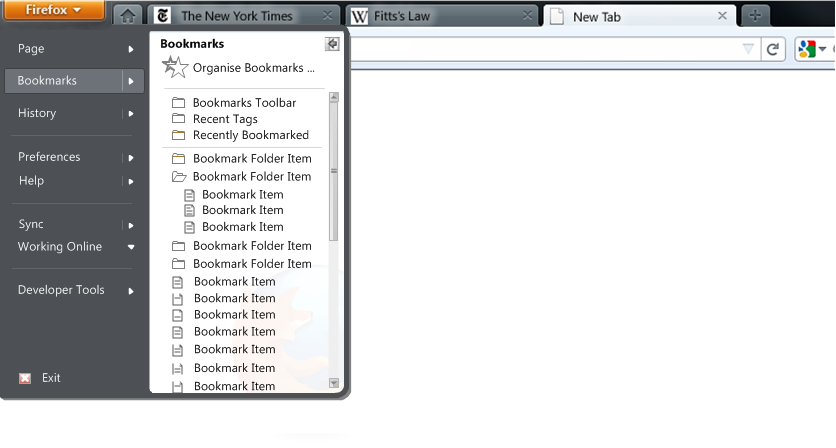 The bookmarks list is scrollable like the Windows Vista/7 "All Programs" option on the Start Menu, and like the Internet Explorer Favorites pane. The icon in the top-right pins the Bookmarks to the Sidebar as in IE8. The menu should also be re-sizable to accommodate long/wide lists by dragging the bottom/bottom-right-corner like the IE8 Favorites pane.
Broccauley 19:40, 28 July 2010 (UTC)
With controls moved to the Status Bar
All mock-ups above assume that the Status Bar is to be scrapped in FF4 (as rumoured). I think that that would be a mistake, and that a better idea would be to increase the functionality of the Status Bar by putting more useful controls on it. Therefore, here is a mock-up of the FF Menu if certain controls were moved to the Status Bar:
The Status Bar would then contain the following:
- zoom and full-screen controls in the bottom-right (like IE/Opera/Office)
-a small control in the bottom-left to show/hide the sidebar (like Opera and old Netscape versions).
-"Working Online" is a status and, instead of being scrapped (as proposed), could also be placed as a small icon in the bottom-right of the Status Bar(like IE/Netscape).
-The new "Sync" feature is entirely status-related and could be entirely controlled from the Status Bar. Broccauley 21:52, 5 August 2010 (UTC)
- Point 2 would only work if the sidebars aren't going to be removed in favor of other functionality. Auscompgeek 01:08, 7 August 2010 (PDT)
- Obviously this is true, however, the sidebars are my personal favourite way to access History and Bookmarks - better than all other views IMO. Who knows what Mozilla are going to do?! Broccauley 09:37, 9 August 2010 (PDT)
Some people have been complaining that the full Page Title isn't displayed any more in FF4 - this could be shown in the Status Bar after "Done" is displayed. Mock-up:
![]()
However, I don't think the bottom of the screen is a natural place to show the page title. Instead, I think this is a better solution. Broccauley 09:37, 9 August 2010 (PDT)
