User:Broccauley/Firefox Menu Explorations
Here are some ideas that I have been exploring for the new Windows FF4 menu design. This page contains a summary of my most recent favourite menu designs. For the complete set of older brainstorming ideas from July/August 2010 (e.g. Office 2010 designs) see the archive.
Contents
Menu Mock-ups
2-pane Win7 Start Menu Style
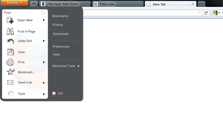
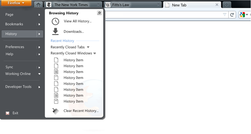
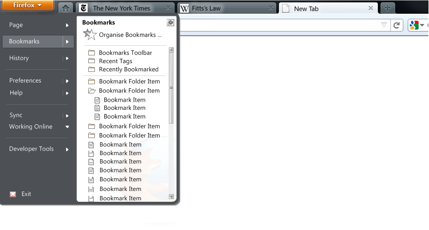
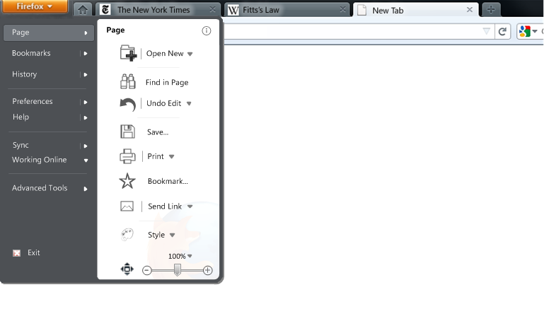
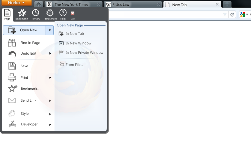
I think that the analogy of the Firefox menu button being the "start menu" for the application is a good one, and hence the styling of the following mock-up:
Note that the grey colour in the above mock-up is to represent Aero glass. The left-hand pane of the menu contains all menu items that are page-related. The right-hand pane contains more global options that when clicked are to be displayed in a new tab. There are no icons on the right-hand side to reduce distracting visual noise. The "Exit" option is placed in a similar location to "Shut Down" on the Windows Start Menu.
Note that the only controls shown from the old Edit menu are "Find in Page" and "Undo Edit" (includes redo functionality). This is because these are the only Edit options that are not context-related and hence don't belong in the more convenient right-click context menu. Full reasoning on why I believe that these are the only Edit options that deserve to be in the menu are found in the "Placement of Contents of the Edit Menu" section below.
The Undo option is called "Undo Edit" to emphasise that it only undoes text-edits, and to prevent new users from confusing it with the functionality of the back button (that necessary emphasis was previously provided by the fact that it was contained within the "Edit" menu).
The "i" icon shows the "Page Info" options that is proposed to be scrapped - there is no reason to scrap Page Info and make it less discoverable by dropping it from the menu! Making it icon-only and subtly tucking it in the corner acknowledges that Page Info is a lesser used option, but also allows it to be kept in the menu.
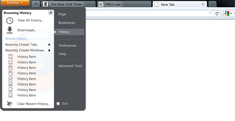
Note that the right-hand pane doesn't contain right-arrows to access a sub-menu for Bookmarks or History. These could be added, but here I am experimenting with the possibility of opening the full "Library" view for Bookmarks/History in a new tab. Quick access to Bookmarks and History could be made by making an IE8-like Bookmarks/History sidebar-like combo feature as described in the "Show/Hide Sidebar" section below.
View and status-related options may be contained in the status bar as follows:

Alternatively, they may also be placed in the toolbar as follows:
![]()
Full detail on the reasoning behind these Status Bar and toolbar designs can be found in the "Why some controls are not in the menu" section below.
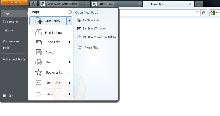
This menu design also borrows the styling from the "Jump-Lists" in the Windows 7 Start Menu. Hovering over the menu item or clicking on the right-arrow will expand the menu to the right with an animation; the first item should be customizable. Clicking again on the right-arrow will retract the right-hand menu again. Here is how the "Open New Page" item will look when expanded:
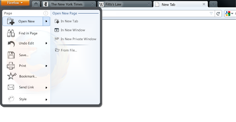 Simply clicking on "Open New" would perform the first action on the list - i.e. "Open New Page in New Tab". "Open New Page in New Tab" is a good default as it exposes the concept of tabbed browsing well to new users (personally I would probably make "Open New Page in New Window" the default as "new tab" is already well-exposed in the UI, and heavy porn surfers could of course make "Open New Page in Private Window" the default!).
Note that this elegantly combines all the old "New" options (including Private Browsing which was badly categorized in FF3 under the "Tools" menu) with the old "Open" option (now styled as "Open New Page From File..."). Note that, apart from Save, the "From File..." (File->Open) option is the only menu option that actually does relate to the local file-system and hence the word "File" is in its name (perhaps "Save..." should say "Save to File...") - this is also a very apposite demonstration of how bad the old FF3 menu was by copying the old "File" menu from word-processors - most of the old FF3 menu options had nothing at all to do with files!
The mock-up below illustrates what the "Undo Edit" option would look like expanded:
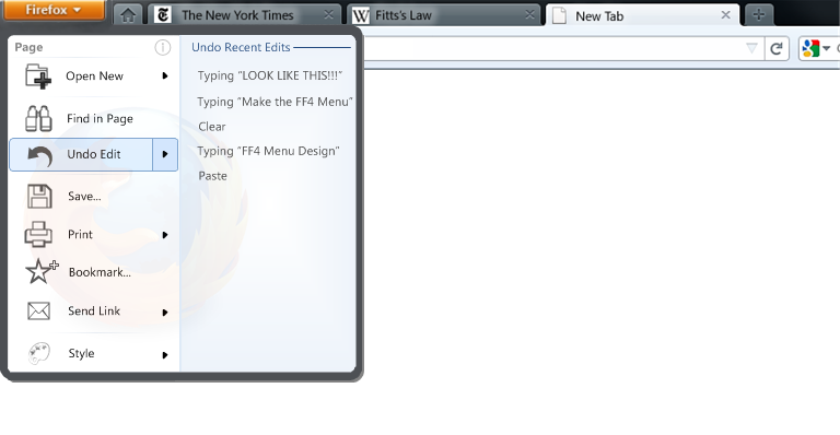 The expanded Undo Edit menu provides an per-page edit history feature similar to the powerful feature found in modern versions of MS Office. "Redo" options will also appear in this edit history list. Mozilla's Aza Raskin talks here about how powerful undo is - it's ridiculous that a good undo feature with explicit undo history like this has never yet made it into a web browser!
The mock-up below illustrates what the "Style" option would look like expanded:
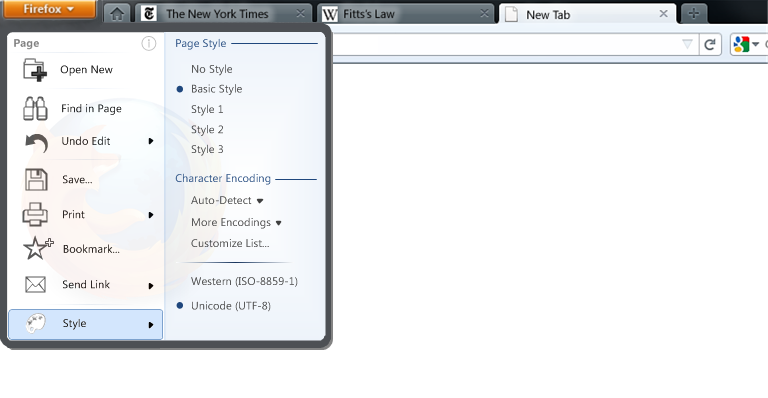 The style option contains both the old "style" option and "character encoding". One/both of these options could also be placed in the "Advanced Tools" menu instead of here. Full details of the reasoning behind the "Advanced Tools" sub-menu can be found in the "Developer Tools vs. Advanced Tools" section below. I think it is important to emphasise that the style option shouldn't be scrapped just because the old "i5" menu design was too long and cumbersome to fit such an option.
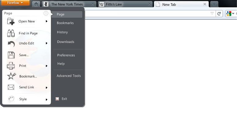
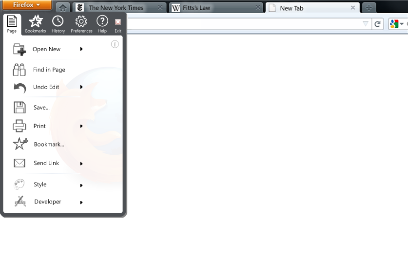
The above mock-ups assume that the options in the right-hand pane either open in a new tab or expand in a traditional-style left-to-right menu. I also wanted to explore what an unconventional right-to-left menu might look like. At first I was not keen on the unconventional idea of a menu opening right-lo-left and avoided it in any of the older designs. However, after making the mock-ups and considering the detail I was pleasantly surprised by the results:
The unconventional nature of the menu is addressed by using an Office 2010-like "speech bubble"-style menu to indicate that what is in the left hand pane relates to the option on the right. The "Page" option is also added to allow the user to navigate back to how the menu was originally.
2-pane Office 2007 Style
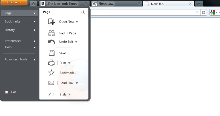
These menu mock-ups keep the Windows Vista/7 Start Menu-like glass styling (grey=Aero glass), but are logically more similar to the 2-pane menu used in the "ribbon interface" in Office 2007 and Paint/Wordpad in Windows 7. They provide a very clear and explicit left-to-right top-down hierarchical logical partitioning. This style of menu is discussed in more detail in the archive.
With Zoom and Sync in Menu
All mock-ups above produce some very nice clean and elegant menus - this is because zoom and Sync controls are not in the menu. However, there seem to be plans to put the zoom control in the menu (terrible idea IMO). Here is an illustration of how the menu could look with the zoom/sync/full-screen controls:
To me this now starts to become a less clean clutter-free design. This is also not nice because zoom is now buried under a menu making it frustrating to adjust the current zoom level. It also means that the zoom and sync statuses can no longer be viewed just with the flick of an eye. For more details see the dedicated section on this issue.
This was exploring how the menu could be made more compact:
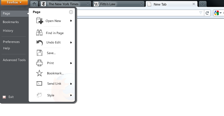
It works quite well!
This is kind-of like a cross between the Windows 7 Start Menu and the Mac OS X Finder:
 Works better than I would have thought!
KDE4 Style
This style offers a highly logical top-down hierarchical partitioning, whilst still allowing short mouse distances to all options.
Concept Discussion
Placement of Contents of the Edit Menu
Alex Faaborg makes an excellent blog post on how web browsers have been illogically following the design of word processors in their user interface design, particularly with respect to the menus. Firefox is NOT A WORD-PROCESSOR.
This also applies to the FF3 "Edit" menu - a menu designed for a word processor which has the primary function to "edit" text and then print it out. A web browser does not have a primary function to "edit" at all - it is mainly to browse existing content. When the opportunity does arrive to edit text it is not in the same format as a word processor - a word processor has the luxury of most of the screen area being editable; in a web browser it is only within small <input type ="text"> or <textarea> tags that editing is possible (this may change with future web-apps, but HTML5 will allow apps to create their own toolbars for such situations).
This lack of edit-ability in a web browser means that menu options such as paste and cut are much more context-sensitive than they are in a word processor.
Let's also look at each of the Edit options and categorize them:
Undo - global action that relates to the entire page
Redo - global action that relates to the entire page
-----
Cut - a context-related action that only relates to the selected text
Copy - a context-related action that only relates to the selected text
Paste - a context-related action that only pastes into the active mouse cursor location
Delete - a context-related action that only applies to selected text and has an even more obvious dedicated button on the keyboard.
-----
Select All - a context-related action that only selects everything in the active mouse cursor location
-----
Find - a global action that relates to the entire page
Find Again - a global action that relates to the entire page and also has its own control in the Find Bar.
From the above I would therefore logically conclude the following:
- Undo/Redo and Find must be placed in the menu as these are global page-related options with nowhere else to go.
- Cut/Copy/Paste are strongly context-related and belong in the right-click context menu. Perhaps they could be made more prominent by adding their icons here too.
- Delete is on the keyboard and should be ignored.
- Select All is context-related and should be on the right-click menu. However, it's current FF3 implementation is very odd as currently you have to select some text before "Select All" will appear - this should be changed to be the same as Internet Explorer where "Select All" always appears.
- Find Again should be ignored as it already has a control in the Find Bar.
- The existing "copy" right-click option can be a bit buggy when copying text from hyperlinks - this should be fixed.
The word-processor-style menus in FF3 date back to the word processors of the 1980s. In 1995 Microsoft introduced the right-click context-menu with Windows 95. This is where most of these context actions belong - not only is the right-click menu more logical for such actions, but it is MUCH more convenient than moving your mouse all the way to the top of the screen.
The type of user who still goes to the Edit menu to select Cut/Copy/Paste is a user who has not moved with the times - they are using a 1980s-designed menu - a menu that is designed for a Macintosh computer that didn't have a right mouse button. Such Windows users have also already had 15 years to move out of the 1980s (in 1995!) and come into the 21st century (if that makes sense!). The type of Windows user who has not adjusted will also likely still be using Windows XP where the Edit menu still appeared in Windows Explorer - this type of user will receive the old menu by default in FF4 so this new FF4 Windows menu design will not apply to them anyway!
Add-on Placement
In Faaborg mock-ups I've seen a dedicated area for add-ons to display in the menu. This would conflict with the "Page" partitioning present in all my designs above. Therefore, I think the add-on developer should be able to choose in which section of the menu where their add-on will appear - this will also benefit the user by having add-ons in a menu location that corresponds to their function.
Add-ons could also default to the "Advanced Tools" section of the menu (see below).
Existing FF4 beta menus have a "Developer Tools" section.
"Character Encoding" is not necessarily a "Developer Tool". "Work Offline" isn't a "Developer Tool" at all. It is clearly a badly named sub-menu.
Either:
- Remove these offending items, or:
- Rename this sub-menu to "Advanced Tools" or just "Tools"; this allows much more flexibility to allow anything that doesn't quite fit into another menu location to be placed here. It could also be a default location for add-ons. It also allows for unforeseen future menu expandability.
Certain controls are not only controls but are also STATUSES - a status should not be hidden buried in a menu, but shown to the user so that they are aware of a change in browser status.
I have placed status indicators/controls for zoom, work-offline, sync, URL hover, and show/hide Sidebar on the Status Bar as follows:

Alternatively, for a more minimal interface, they may be also placed on the toolbar as follows:
![]()
Full details on this toolbar design can be found in its own dedicated essay.
Zoom
For the zoom status/control I have created a separate detailed essay outlining various design choices for zooming.
Full Screen
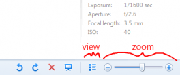
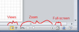
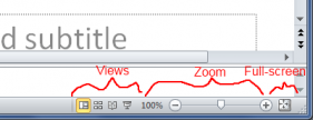
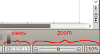
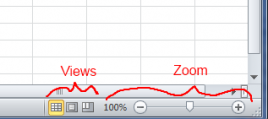
This is a logical decision that follows on from the placement of zoom. Zoom is a view, therefore it is logical to group views together. This also follows the familiar convention used in the latest Microsoft Office, OpenOffice 3, and Windows 7 applications as illustrated below:
Show/Hide Sidebar
This is another view control. While it could be argued that it should be logically be placed with the other view controls (zoom, full-screen), it is placed on the left to give a good visual mapping to appear directly under where the sidebar appears. This issue could be resolved by moving the Sidebar to the right of the screen instead of to the left.
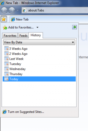
Personally, I think the sidebar is the best way to access History and Bookmarks - both could be combined as they are excellently done in Internet Explorer 7/8 as follows:
Perhaps the existing Bookmarks button in the FF4 betas (on the toolbar to the right of the search box) would be better if it showed both Bookmarks and History (like IE8) and could be pinned as a Sidebar to the right.
Sync
Sync is both a status and control. It is one that the user will only want to check up on occasionally, and therefore the best place for it is in the user's peripheral vision on the Status Bar or at the edge of the toolbar. Important is that the status of sync should always be shown to the user - it shouldn't be hidden away in a menu where the user will never notice any change of status.
Work Offline
Statuses shouldn't be hidden in menus - the user should be able to quickly realise whether or not the current page is being loaded from cache. It is also a control. The Status Bar is one ideal location with ample space.
Perhaps the more compact and retro Netscape "plug" icon could instead be used to give some reminiscence of Firefox's Netscape roots!:
Alternatively, the "Preferences" sub-menu could be re-named "settings" and Work Offline placed in there (as in Opera).
Future Extendibility
Another argument for a dedicated area for views is that has the space to allow the flexibility for adding extended browser functionality in the future.
For example, take Apple Safari's Reader View:

The location of the Safari "Reader" control is just intrusive and clutters the toolbar. If Firefox were to implement such a "Reading View" feature then it could simply add a small book icon along with all the other views on the Status Bar (I have some ideas for expanding this reading view into a more powerful feature, but that's for another time). A dedicated area for view controls is a much more appropriate non-cluttering and non-intrusive location for future features such as a Reading View.
Use of the Alt key
I don't like the proposed use of Alt+F to access the menu. This makes it very Firefox-specific and hard to move between browsers - it would be horrible for Internet Explorer to have Alt+I and Opera to have Alt+O for their menus, making user familiarity between browsers difficult. Opera 10.6 just uses the Alt key.
A press of the Alt key alone should allow a very quick access to the menu. This is also nicely analogous to how the Windows Start key on most keyboards allows direct quick access the the Windows Start Menu.
The current use of the Alt key to access the old traditional menu should be only a temporary transitional fix. This functionality implies that the new menu is not as functional as the old one - if the new FF4 interface is designed well enough (as I hope it is here!), so that all useful functionality is contained within the new menu or exposed in an obvious place in the UI, then there will be absolutely no need for a user to ever use the old traditional menu again.
Display of Keyboard Shortcuts
The above menu designs don't show the keyboard shortcuts for each item as this would clutter the compact menu. It is important that keyboard shortcuts are easily discoverable for new users. Therefore, a tool-tip should appear showing the keyboard shortcut for each menu item on mouse-over of a specific menu item, and appear automatically for all menu items upon using the Alt key to access the menu.
(on second thoughts, maybe the Ctrl key would be better to access the menu since most useful keyboard shortcuts in Firefox use Ctrl and not Alt).
Feedback on "i6" Faaborg iteration found in FF4 beta 5
- At first I found the two panes quite confusing. I think this is because there is no explicitly labelled partitioning to show what each pane is to represent.
- Current partitioning is too subtle. ("actions" on left vs "places" on right; the latter is also not actually true since there are actions contained within the sub-menu of the right-hand pane.)
- The menu options don't have as a clear logical hierarchy as the mock-ups above. e.g. Firefox->New Tab->New Window is nowhere near as logically clear as Firefox->Page->Open New->In New Window. Firefox->Print is also not as clear as Firefox->Page->Print etc.
- Do you have anything against partitioning the menu by "page"? The original FF3.7/FF4 mock-ups had both a "page" and "settings" menu? This was there in these original mock-ups for a good logical reason. Why not keep this logic in the two panes used in the new single Firefox menu?
- Cut/copy/paste icons look really out of place, have small click-targets, and from personal experience aren't recognizable icons. These options are also completely unnecessary to be in the menu as they are logically context-actions, and are more convenient to be accessed from the right-click context menu .
- Drop the icons from the right-hand side (as Microsoft did for the Windows Vista/7 Start Menus): reduced clutter, and stops eye from losing focus (or perhaps only show an icon on mouse-over like the Windows Vista/7 Start Menu).
- Exit belongs on the right - same position as "shutdown" on Windows Start Menu.
- Private Browsing is logically better grouped with the other New Tab/Page options (as on the Windows 7 jump-list). Why also is Private Browsing so prominent? "Private Browsing" aka "Porn Mode" is a "sneaky" feature that should be in a "sneaky" (but yet logically easy and quick to find) location :). Do you really want a mask from a swingers party to be in such a prominent position in a family-friendly browser?
- Still small icons - is this just for ease of early implementation or are there plans to allow larger click-targets in the future?
- Still non-Aero styling (an easy early implementation as above?). This isn't actually just about having pleasing aesthetics - this type of styling allows more flexibility than the old traditional menu style e.g. allows an offset placement of the "Page" heading or "exit" to give the explicit logical partitioning that is needed.
- "Work Offline" isn't really a "Developer Tool".
