Mobile/UI/Designs/TouchScreen/Proposal3
Contents
About this design
This design also strives to meet the requirements discussed in Proposal 1. Additionally it incorporates feedback from that proposal:
- Maximize space for web content (Christian)
- Embossed Firefox logo to activate menu toolbar (Christian)
- Zoom via drag (Aleks Totic)
Main Screen
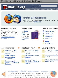
Here is a drawing of the proposed main screen.
- At the top is a thin title bar.
- At the bottom right is an "embossed" Firefox logo that allows quick access to the most frequently operations. More on that later.
- At the bottom left is an "embossed" back button. This allows quick access to the previous page, something that is very useful when navigating multiple links from a home page, e.g. clicking on different links from the main cnn.com page.
An important feature of this main screen is that users can visit a website, and visit different links on it (one at a time, returning the main page after reading a link), without ever activating the toolbar:
- Pan/Scroll directly by dragging the screen
- Zoom using touch/hold/drag
- Go back with one tap on the "back" icon.
Touch operations on this screen are discussed below:
| Action | Result | Comments |
|---|---|---|
| Single tap | On a link, navigate. Elsewhere, pan page to center on tap location. | |
| Double tap | Switch between full page view & zoomed view. If in full page view, double tap will zoom the page to readable size, centered on the tap location. | |
| Touch & drag | Pan in the direction of the drag | |
| Touch, hold for 1s and move | Zoom in or out, similar to Alex Totic's mockup | |
| Touch, hold for 2s | On a link, this can show link information. On text, it can switch to text selection mode (for copy/paste operations). |
Activating the toolbars
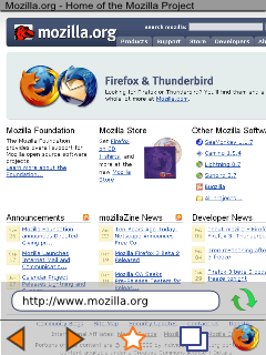
Tapping the embossed Firefox icon will display the toolbars as shown to the right.
On devices with a multitouch interface, all functions could optionally be accessed without menus. This would be more intuitive, and not too onerous. For example, a user could go back and forward with left and right swipes. Going to bookmarks could entail pinching the current page until it is smaller than the screen, which would fill the page with thumbnails of web pages. The current tabs would be in the center of the screen, with the most frequently used bookmarks surrounding them.
- The bottom toolbar contains buttons for back, forward, places and tabs.
- Tapping on the back/forward buttons will navigate back/forward and hide the toolbar
- Tapping once on the places icon will bookmark the current page. Tapping twice can open the places screen (to be defined).
- Tapping on the tab button will open the tab screen (to be defined).
- Tapping on the Firefox logo will close the toolbars.
- The second toolbar (stacked atop the bottom one) has the URL textfield and the reload button.
- Tapping the URL textfield will open the URL entry screen (to be defined, but substantially similar to the URL Entry Screen of Proposal 1
Support for Mobile Firefox extensions
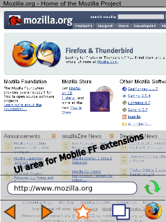
Additional toolbars can be stacked atop the standard toolbars to support Mobile Firefox extensions.
Note: Extensions are a key feature of Firefox and any UI proposal must provide a UI mechanism for extensions.
Tab Screen
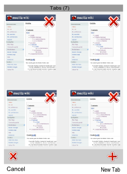
Tapping the tab icon on the toolbar displays the tab screen. This display is a simplified version of Proposal 1.
- Tapp on a tab thumbnail to switch to that tab
- Drag the screen left, right, up or down to display additional tabs
Note: Unlike Firefox on the desktop, it may not be possible to keep all tabs loaded in memory, especially in devices with less than 64 or 128 MB of RAM.


