User:Wolgamiz/Tagmarks
This is the second main update of this page. To understand everything mentioned in this page, please read On Tagging.
Contents
Why Use Tags?
- Tags would fit well into each of the three main Mozilla programmes (Firefox - instead of bookmarks, Thunderbird - for emails and separately: address book entries, Sunbird - for events) and could be used to improve the Mozilla brand through this kind of consistency
- An overladen Bookmark menu is quite useless and a function to search for bookmarks is only available via the Bookmark Manager (quite circular)
- Tags can be used better to summarise a website's content than bookmarks
- Users can find marked pages with more than just one keyword (if they used more than one tag to mark the page)
On Dria's Suggestions
I absolutely support Dria's suggestions On Tagging in Firefox, but sometimes I would want to add something to these ideas, sometimes, I would think, these ideas even go too far. Therefore I will now do some remarks to Dria's post here.
Tags & Tagmarks (Just a Definition)
I suggest that we should distinguish between Tags (= the "category") and what was till now called bookmarks (Dria is absolutely right, the internet is not a book), I will just call them tagmarks (perhaps not a good word make-up) in the following.
The Icon
I like Dria's icon (green is a good colour (still unused for icons), and it has an analogy to the letter T for Tag), but Firefox is a more or less internationalised browser and not everyone in this world will be able to understand T. I propose, to use a symbol like
<>
which already has a connexion to tags, though it suggest that these are HTML tags.
Fake Screen Shots
Browser Window
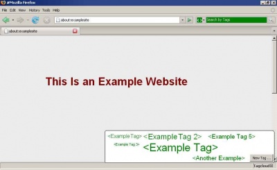
This is just a how-it-could-look illustration. (And by the way: could anyone tell me how I can make a thumb from this picture? Feel free to edit the page therefore and remove this remark, then.)
I will now explain the elements of this image:
- Where's the bookmark menu?: I eliminated it, due to the fact that I don't think it's still necessary. Just imagine the Tools menu containing something called Tagmark Manager. The Tagmark Manager could look like the current Bookmark Manager, save that it would list all available tags, not the folders in the right sidebar.
- Search Bar: The Search bar is used to replace the bookmark manager (just as Dria explained). It looks green now, because I thought, the user should know that it doesn't actually search the web but just his local tagmarks. I suggest to also implement a Live Bookmarks / Live Titles search (with an orange background of course).
- Tagcloud: The tagcloud in the right lower edge of the Firefox window is one of the most important things in my idea, it would just list up the most important tags of the user on top, and give the options scroll down to see the lesser used tags and to create a new tag. You could now drag a tag on the page you're viewing and it would enter in the level of a tagmark. I put the tags in the brackets people are used to from HTML tags.
First Update: Tagcloud
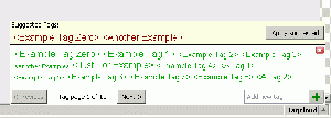
This is another Tagcloud example, this time looking more realistic, and it's including a yellow marked area for Suggested Tags (looking a little like the notification bars popping up, when extensions can't get installed or a phishing site was detected). A bayesian behaviour-analysing feature for tagging, in my opinion, would be really handy and when this system suggests tags, these tags could in the tagcloud be printed just like that. I also have used buttons to scroll between the tags, if they get too many; a scroll bar might have looked odd in between the close button and the Enter New Tag field (which now isn't any more connected to a dialogue box).
I think the bayesian system should not suggest more than three tags, because then probability sinks that the user really wants all those tags for his page and the space in the yellow bar is also limited.
Second Update: Tagmarks Sidebar
Third Update: Search Results Page
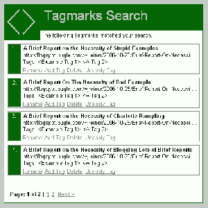
This is some kind of what the results page of the tag search could look like. It would sort the links by how often they were viewed (it may be possible to also include Google's page rank into the ranking calculation, however, I don't think Mozilla should rely too much on Google). When I thought again about the necessity of a manager window for the tagmarks, I got to the idea that it would be sufficient to use a sidebar, which would simply display all existing tags and make an HTML page pop up in the main browser window, when you click on it. This HTML page should contain a few managing functions, i. e. Delete / Rename Tagmark, Add New Tag (aka Attach Tag), Detach Tag (aka Unapply Tag, this would be used for removing a tag from a tagmark). Users also might want to order the tagmarks by their relevance, so there should be an ability to drag the results on the desired position (I saw this only lately on a Google-sponsored testing search interface I can't remember the name of). You might also be able to drag the links to the Tag Sidebar (font size of the "touched" tag increases to 10 pt) or the Tagcloud to attach a new tag to it.
Additional Suggestions
- There are still some things I'd like to add: For Live Bookmarks there could be an automated (of course anonymous) tag exchange between users who already have tagged feed articles and users who don't, so feeds a lot of people subscribed to, for example the BBC or NY Times or ... (whatever) feed, would be tagged without any handiwork of the user. (There should be an option to switch this feature off.)
- I don't think tagging should be associated with history (refer to Dria's page), just because no user would really want to store massive amounts of unnecessary but tagged data on his computer. I, for one, always delete history.
- The Tagmark Manager should contain a category Currently Untagged: in case a user deletes a tag and the tagmark doesn't have any other tag, it would just be categorised as Currently Untagged
- In the first version of the browser with a tagging feature there could be an option dialogue to choose between normal bookmark and tagmark behaviour
- Where to place the Tagcloud if not in the status bar? (Users often turn off the status bar)
- A separate Tagmarks menu - although users don't expect menus to open something like a cloud and it would not seem logical that the Tagmarks Manager would then still be in Tools menu and it would have to be moved into the Tagmarks menu, containing a large cloud which would result in a deformed menu
- As a dropdown from the address bar / search bar - is this practical or just cluttering up these elements?
- The tool bar - actually this one is my favourite alternative place just due to the fact that almost everybody displays this bar (unless for presentations (where tagging is unnecessary)), though still users could remove Tagcloud from it (this is freedom of choice)


