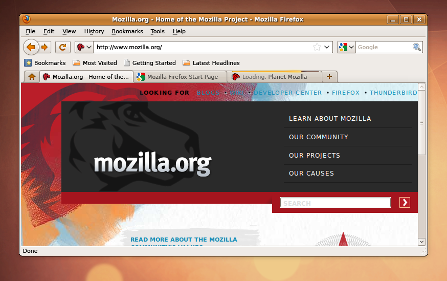
User:Tro/Firefox 3.7 Linux Theme Mockups
These are WORKS IN PROGRESS, NOT FINAL! THEY ARE FOR DISUCSSION!
Feedback is entirely welcome and encouraged. Hit the discussion button at the top :)
(For 4.0 Mockups: User:Tro/Firefox 4.0 Linux Theme Mockups)
Contents
Linux Theme Mockups for Firefox 3.7
Update to Visual Styling
In addition to theme and UI changes already discussed for Firefox 3.7 and 4.0, there are some proposed Linux specific visual changes:
- Consistent Back/Forward Buttons: Use the same back/forward shape as on the other platforms. The back button would use the same texture as the other buttons however it would be round and larger.
- Buttons vs Icons: Switching to a button+glyph style for the toolbar items. This would be instead of the more representational style that is widely used. It also is a deviation from the common system standard of having icons and then a button shape on hover.
- Curvier Tab Shape: Match the tabs to the proposed tabs on Windows and Mac while keeping the native texture and color.
- Removing Toolbar Separators: Reduces visual complexity as well as maintaining external consistency.
Alternative Icon Treatment
![]() Another Idea would be to include the back/forward shape but use traditional icons instead of glyphs everywhere else. However this looks a little strange and doesn't meet the goal of cross platform consistency.
Another Idea would be to include the back/forward shape but use traditional icons instead of glyphs everywhere else. However this looks a little strange and doesn't meet the goal of cross platform consistency.
Theme Variations on Various System Themes
The most ideal approach to handling various system themes would be to use the native button style, theme specific icons and replace the glyphs based on color scheme.
Some examples of how this could work out:


