Thunderbird/Netbooks/Designs/Ideas
Contents
Mockups
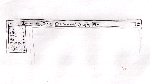
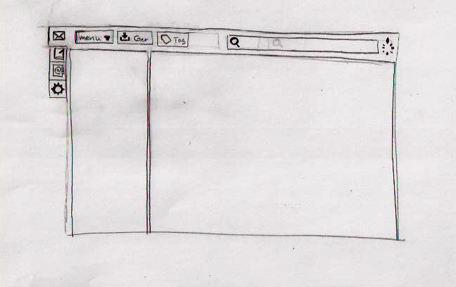
File menu could be a dropdown in the toolbar.
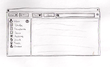
main layout
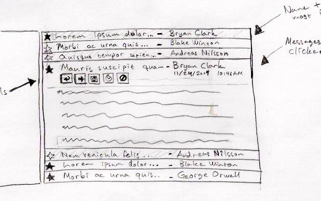
message pane
In order to save space, the message list and message pane could be combined and messages could then expand on single click.
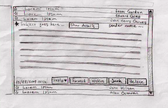
A variation of the same, but with buttons on the bottom of the messages. Bigger buttons makes it easier to hit with a trackpad which is the most likely input device on a netbook.
main message tab
The regular message reader tab.
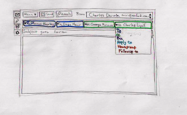
compose tab
Writing a new message is just as easy as selecting the writing tab. Colors indicate to, cc, bcc etc who are all on the same line and offers a dropdown to select between the different types.
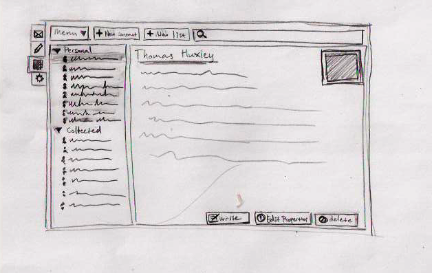
address book tab
A lot of installations ends up with just two address books (personal and collected) and a lot of empty space. This would put address books and contacts in the same pane (that is expandable) and allow the larger amount of the window to the actual contact.
