Pancake/French Toast/UX/Minimum Viable Product
Contents
Screens
What and why?
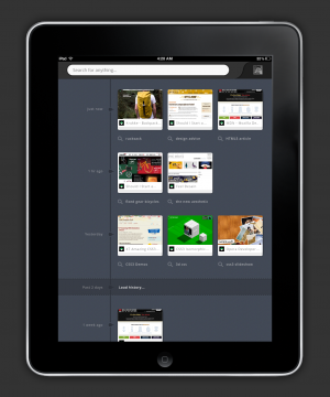
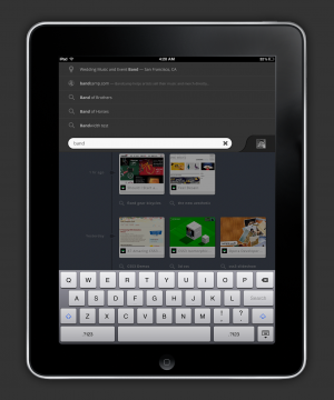
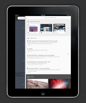
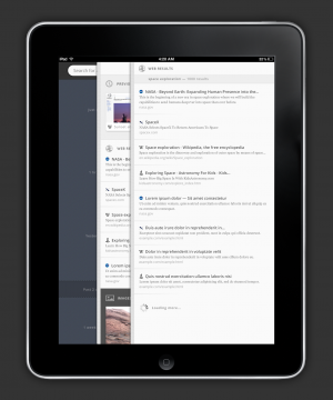
The minimum viable product is a tweaked user experience on top of Pancake's old architecture. It's a platform from which to build out the rest of French Toast.
Evolution, not Revolution
- Pancake Today: A search-focused browser in the cloud
- Pancake Tomorrow: A search-focused browser in the cloud
Use what you have
Starting from scratch is dumb.
We took a good look at the architectural pieces Pancake had already developed and pulled them together into a coherent and compelling user experience.
Because the user experience is built around the same core job-to-be-done, we already have a platform for this app. We’re not throwing away work.
We can reconfigure what we have now into a minimum viable product, then grow it bit-by-bit into French Toast.
At each step along the way we have a compelling app with clear user benefits.
What is the MVP
French Toast was designed with a minimum viable product in mind from the very beginning.
- Core job-to-be-done: “Help me find x”.
- Minimum viable product: A search-focused browser in the cloud
Gameplan:
1. Client switches from the "side-scroller" metaphor to the new layer metaphor 2. Drawer becomes “Recent Searches” 3. Search Results have the same data with a UX refresh 4. Viewer controls move from top to side
