Mobile/UI/Designs/TouchScreen/Fennec 1.1+/Option A for Awesome screen layout revision
OBJECTIVES
- To make Fennec more compatible with different kinds of displays (wide/narrow), device orientation (landscape/portrait) and text input methods (hardware/on-screen), which are characteristics of mobile devices.
- To combine web address editing and web search features so that the functions and features known from desktop Firefox would be available also for mobile: both features could support suggestions and therefore reduce typing effort for getting the desired result.
FUNCTIONALITY
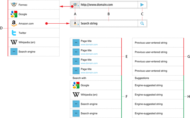
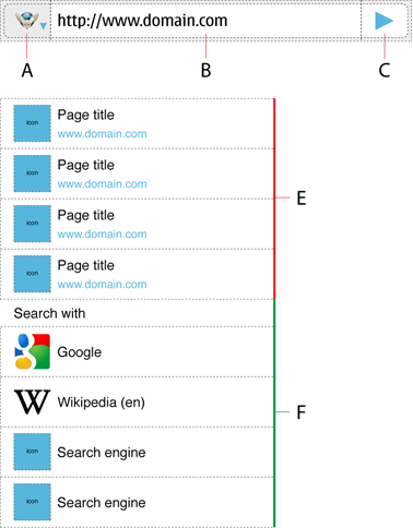
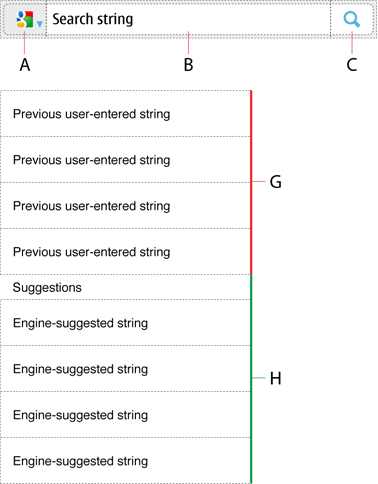
Awesome bar would consist of the following elements in the view for it:
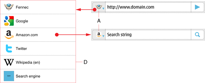
A) Button for indicating and changing the engine/functionality of the Awesome bar
B) Text entry field for web address or search phrase
C) Button for executing the action for the entered text string
D) Menu for selecting the functionality of the Awesome bar: List of engines (i.e. Fennec + Search engines)
E) List of web pages suggested by browser engine
F) List of search engines (to be used instead of Go button) in the order of frequent or recent use
G) List of previously entered search strings
H) List of search strings suggested by a search engine
The functionality of the Awesome bar would be determenided by the engine selected for it: Fennec or any of the installed Integrated search engines (such as Google, Amazon.com etc). Because the main use case for using the Awesome bar is opening a web page, Fennec should be the default engine for it when the user has accessed the view.
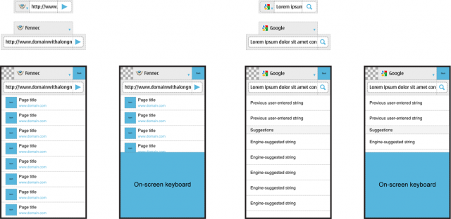
In default condition, user could enter a web address or free from text into the text field (B) and the browser would list suggestions (E) below the Awesome bar. The list of suggested web pages (E) would be followed by the list of search engines (F). The user would have three ways of opening a desired web page:
- by tapping the Go button (C) after completing the web address in the input field (B).
- by tapping a desired web page from the list of browser engine suggested pages (E).
- by tapping a desired option from the list of search engines (F) to make search for the entered text string (B).
The last option above applies to the case the browser was able to find only few or none matching web pages from the bookmarks or history. The idea is to provide options for the user instead of blank screen of non-functional information such as ”No results”. Obviously, it would work best for free form text.
The user could change the functionality of the Awesome bar (e.g. from address editing to web search) by tapping the Engine selection button (A), that would invoke the menu of available engines (D). When the menu is open, the user could select the desired engine by tapping it or cancel the whole thing by tapping outside of the list. If the user had entered text into the input field (B) before changing the engine, it should be preserved over engine changes. If the user had not edited the text inside Awesome bar (i.e. it would contain a web address of the current page) before switching to an Interated search (e.g. Amazon.com), the input field could display the most recent search string after the engine change.
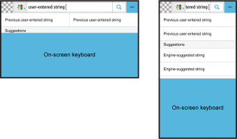
Integrated search engines would work similarly to desktop Firefox. While the user is entering text into the search field (B), the UI could show the list of matching text strings (G) the user has entered previously and/or suggestions (H) provided by the Search engine (if supported by it, cf. e.g. Google). The user would be able to activate search by tapping the Search button (C).
LAYOUTS
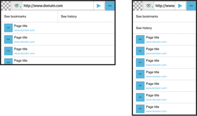
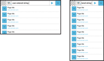
Basic layout when the user has opened the Awesome bar view
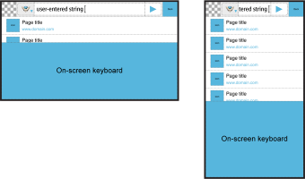
Adaptation to screen size/orientation and (non-fullscreen) on-screen keyboard.
| Engine | wide/landscape and narrow/portrait screen' 'without on-screen keyboard |
wide/landscape and narrow/portrait screen with on-screen keyboard |
| Fennec | ||
In the images above, the text entry field is tiny in the narrow screen / portrait use and therefore a subject of usability problems. The text entry field could be made 2.5 times bigger by splitting the options for engine selection and actual editing into two rows. See the figures below:
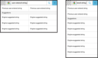
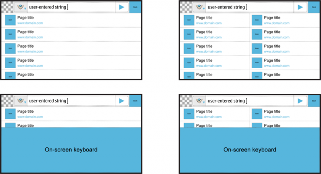
Currently, Fennec displays suggestions always in one column list. This can cause usability problems especially when entering text with on-screen keyboard in wide screen / landscape use. If Fennec would display lists in two columns whenever there would be room for it, it could double the number items it was able to show at a time. See the figures below:
