Mobile/UI/Designs/TouchScreen/Fennec 1.1+/History
For layout updates, see UI/Designs/TouchScreen/Fennec_1.1+/Awesomescreen_content_structure_revision
Summary
Currently, Fennec (v. 1.0) has a limited support for browsing history. The right-side toolbar contains Back and Forward buttons and you can search browsing history (based on text input) with the Awesome bar. The missing features are the alternative ways for returning back to a desired page you have visited recently (irrespective of which tab was used for it) or a longer time ago (e.g. in an already closed session) when you could not use the Back or Forward button for it or text input based awesome bar could not help you (because you could not remember site address, name, keywords etc). The desktop Firefox (3.5.x) provides lists of recently visited pages and all history, and you can also sort content in the Library. The features supported by desktop Firefox are useful for mobile too.
In this proposal, the Recent history (available from History menu) and All history (in Library) features of desktop Firefox are merged into one History view for Fennec.
Feature description
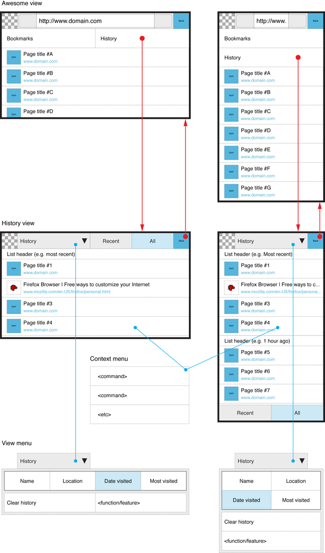
As Awesome bar/screen itself will provide the best support for finding/filtering content (such as bookmarks and browsing history) based on text input, the History view would serve the same purpose as Bookmarks view, i.e. provide an alternative way for accessing web pages. In this proposal, the user could access the History view similarly to Bookmarks view i.e. by tapping a corresponding button in the Awesome screen.
The History view could support at least two alternative ways for seeing the history items:
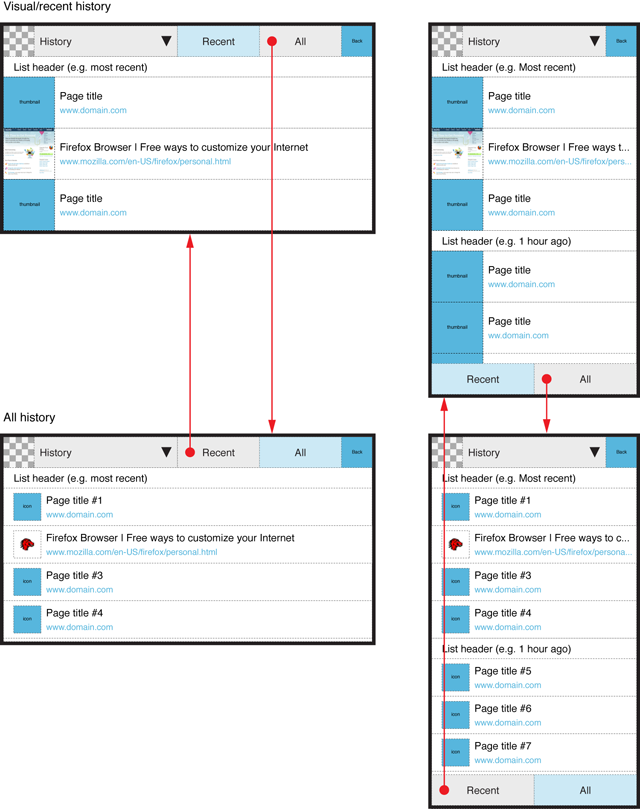
- broad/rich information showing large-scale thumbnails/screenshots of web pages in addition to page title and web address.
- minimal information showing small-scale favicons in addition to page title and web address.
Reason for showing broad/rich information on a history item is to utilize visual information for finding the desired page (intuitively,) quickly and reliably (because a picture cab be worth a thousand words). Also, in some cases favicon, page title and web address altogether may not give useful information for distinguishing which page from a dozen is the desired one. In any case, thumbnails of web pages should be quite big so that they could serve the purpose for recognizing what pages they are representing. The bigger the screenshots are, the longer the list will be, so broader/richer information on history items is potentially useful/workable for a relatively short list of history items instead of all history that may consist of hundreds or thousands of items. The shortened history list could apply to items that are available from the current tabs (of ongoing session) and/or just some limited amount items e.g. 25/50/etc depending on performance requirements etc. However the layout and scope of broad/rich information should be a subject for discussion.
The minimal information would suite best for a long list of items where there is need to make the list as compact as possible. In this case, the graphical information on web pages could be favicons (although they are not provided by all sites or can be the same for different sites e.g. blogs etc) because generally they are small in size. Still, they can/may help in finding the desired page easier.
In any case, the browsing history should not contain duplicates of same pages so that the list would not get long just for nothing (and thereby degrade usability). If the user had visited e.g. 3 pages 10 times each on a site by using the links available from the pages, the Browsing history should show only 3 items in the order of visit time/date (or other user-selected sorting order) instead of 30 items. Most likely, users want rather to see the visited pages in a relevant order than statistics how many times in what order they have been visited.
When the History feature would be accessed from the Awesome screen, there is no point to create artificial connections to tabs. The History view (recent or all) should show items visited with any tab. The use case is that the user wants to return to a previously visited page and the UI should enable it (despite of how the user visited it). Shouldn´t it?
Browsing history should have as flat structure as possible. Also, switching between views for broad/rich information and minimum information could be done with tabs. Because flat structure can make lists long, the UI should provide a fast-scrolling feature, that would enable quick navigation to different parts of the list. The method and UI for fast scrolling is a subject for discussion and development in general because it could be useful also for bookmarks etc.
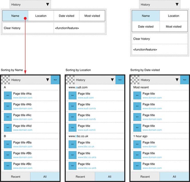
Because Awesome screen supports searching/filtering, the History view should support other ways for finding desired content e.g. by providing various Sorting methods such as Name, Location (i.e. site/domain), Date visited and Most visited that are not available in the the Awesome screen. Sorting options does not have to be instantly available/visible all the time and to tackle linguistic problems etc they could be placed to the History view menu (cf. site menu in the Main screen).
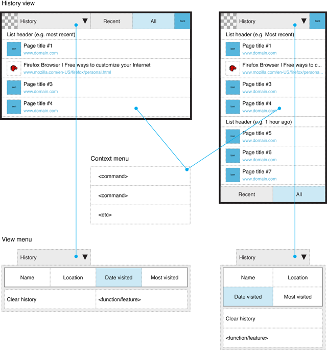
The History view should have a View menu for the sorting options and commands related browsing history like Clear history etc. If Fennec would support more commands for a history item (like "Open in new tab", "Delete this page", "Forget about this site") than just opening it, they should be available from a Context menu (similarly to Desktop Firefox).
Layouts
See the image below for accessing Browsing history from Awesome screen and returning back to Awesome screen, and main elements of the History view.
See the image below for the layouts for broad/rich and minimal representation of history items. It describes also the method for switching between these views.
See the image below for examples of sorting history items.
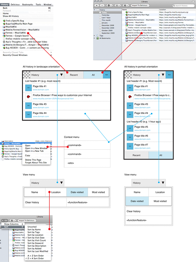
See the image below how the proposed UI for Fennec corresponds with the desktop Firefox (v. 3.5.x).
Open issues and topics for discussion
- Layout for broader/richer information. E.g. Should it be horizontally pannable timeline in which case it could not be sorted (unless sorting would change also the layout that might be a bit overkill) but it would provide better conditions for optimized presentation of screenshots in different orientations of device.
- What content broader/richer information on web pages should apply to: just items available from currently open tabs or any recent item visited with currently open or already closed tab.
- Method and UI for fast-scrolling
