Labs/ConceptSeries/StudentOutreach/AshesiCollege/HomeDash
Contents
- 1 TEAM HOMEDASH
- 2 CONTACT TEAM MEMBERS
- 3 TOPIC
- 4 MAIN IDEA AND CONCEPT
- 5 DESRIPTION OR GOAL
- 6 RESEARCH
- 7 PRIMARY PERSONA
- 8 PRIMARY SCENARIO
- 9 WHICH PROBLEM(S) DID YOU IDENTIFY?
- 10 WHY ARE CURRENT SYSTEMS UNABLE TO SOLVE THIS PROBLEM?
- 11 WHY DOES OUR DESIGN SOLVE THIS PROBLEM (ABOVE MENTIONED)?
- 12 MAKEUP OF OUR DESIGN
- 13 PROTOTYPE (1st Iteration)
- 14 VIDEO PRESENTATION OF 1st ITERATION
- 15 USER TESTS
- 16 PROTOTYPE (2nd Iteration)
- 17 CALLOUT DETAILS
- 18 FEED BACK AND IMPACT
TEAM HOMEDASH
Are people buried among tabs, pages, history and notifications? How can a browser help people manage that all that information? How can a browser help users discover and also share new meaningful content?
CONTACT TEAM MEMBERS
TOPIC
With more and more tabs, pages, history, search, bookmarks and notifications, how can we use the browser space to help people manage this information, as well as to discover and share new meaningful content?
MAIN IDEA AND CONCEPT
The main idea of the project is to afford user the ability to organize and document/save their browsing history even after internet connection has been lost. The browser with the help of our design will handle the removal of unsaved entries that are also out of date.
DESRIPTION OR GOAL
The goal of this project is design a software application that will help users keep track of the browsing history even without internet connection. The other goal of our application is facilitate meaningful content discovery between users.
RESEARCH
PLAN TO IDENTIFY USER NEEDS
For this project, the group has decided to use only interviews, observation, studying documentation and reviewing similar products.
Interviews: We plan to ask users how they currently organize and document their browsing activities. We intend to also find out which product(s) they currently use for the fore-mentioned and what they would want to improve if given the chance.
Observation: We plan to observe the users while they organize and document their browsing activities. Our observations will help us structure our design to best suit the users.
Studying documentations: The group plans to study documentation and manuals of similar products (if available) in order to understand the stepwise procedures users go through, to achieve and perform certain desired tasks. This will help the group get background information about the project and user behaviour.
Reviewing Similar Products: The team is going to research similar products in order to help us generate alternative designs. The review is also going to help us identify some user requirements that we might have missed.
PRIMARY PERSONA
NAME: Kwesi
AGE: 22
OCCUPATION: College Student
MARITAL STATUS: Single
INTERESTS: Listening to/making music, reading comics, writing code
ATTITUDE: Ambitious, motivated and explorative
Kwesi is a college student in majoring Computer Science (CS). He is passionate about softwares and software development; he enjoys writing and testing code. He also enjoys viewing CS forums just to see what others have been able to accomplish. His favourite site for CS-related news is http://www.allthelastcsnews.com. Kwesi’s other interests are in reading comics and music. His favourite comics are released weekly online. He visits a particular manga site to read them since that site has all his comics available for reading and downloading. Kwesi loves to play funk and jazz-funk music with his friends; he plays the guitar. The group shares music resources like music video tutorials and performances of great funk performers. His band; made up of his close friends, are all students of the school he attends. When he is not doing his school work, hanging out with his band, reading or listening to music, he plays his guitar solo. Kwesi’s online activities include browsing for; new manga, music videos and tutorials, uploading class assignments and downloading coding resources, viewing forums, chatting with his friends on popular social networks and sometimes random blot viewing. To share new interesting things that he discovered online, Kwesi usually downloads them onto a portable drive and gives the drive out to his friends to copy. To keep track of his browsing activities, Kwesi uses bookmarks, history and sometimes just leaves the browser pages unclosed. He wishes to have a software programme that can document his activities, without much effort from him.
PRIMARY SCENARIO
On Thursday Jerry asked Kwesi, “Kay, can you please send me the link to the site you spoke about last week?” Sure! Kwesi replied. “I will send it as soon as I get to my room”, he added. Kwesi and Jerry parted ways after their band practice. After Kwesi entered his room, he put his guitar at the usual place; close to the bed where he sleeps and walked straight to the study table. His laptop was on the table. He pushed the power button and after a few seconds, started to type in his password. When the computer was ready to use, he started his browser. Kwesi started thinking about some keys words in the URL of the site he was looking for. He was going to type the word into the address bar and wait for the autocomplete function to help him but surprisingly, he could not remember anything. He wanted to check his bookmarks, and then he realized that he did not bookmark the page. There was only one thing left to do. Kwesi clicked the history option on his browser hoping to find the site he was looking for. His first reaction was to search through the sites he visited from about 2 weeks earlier to present-day. The list seemed endless; he started by looking at the small logos at the side of the URLs to try and identify the page. After carefully scanning through the list he found it. “Finally,” Kwesi whispered. He copied the URL and pasted it on a text file. Kwesi called Jerry on his phone and said, “I found it, check your inbox I’m about to send it.” Kwesi open his mail and attached the text file containing the requested website address. Click…click, he hit the send button and said to himself, “I wish there was an easier way to do this.”
WHICH PROBLEM(S) DID YOU IDENTIFY?
From our research we identified two major problems. (1) Most often, after users no longer have access to internet but want to access bookmarked or saved pages, the browser recalls the URL and tries to reload the page. Since there is no internet, the page does not display. (2) Usually, when users want to send URLs or links to others, they copy the link from the address bar and mail it. These are the research findings that led the team to our first concept/prototype.
WHY ARE CURRENT SYSTEMS UNABLE TO SOLVE THIS PROBLEM?
The current systems were not built in our local context hence; the issue of unstable internet connection was not accounted for. There are ways of dealing with the issue at hand but the knowledge is only available to mostly advanced and intermediate users of the internet/browsers.
WHY DOES OUR DESIGN SOLVE THIS PROBLEM (ABOVE MENTIONED)?
Our design is not a new idea that will confuse users. It is a combination of all the ideas that users are already familiar with. It incorporates existing structures into making one efficient and reliable concept that does not require any new learning skills. The design uses 'hints' to draw the attention of new users to the functions available.
MAKEUP OF OUR DESIGN
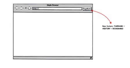
Our design reused existing concepts namely; histories, bookmarks and ‘save and quit'. With a little improvements to these concepts, our design mixed them to form our concept; namely 'PageMark'.
A bookmark consists of the name/title, tag, URL/location, favicon, dates added and sometimes visit count of the entry.
The history function of the browser saves all the URLs of pages previously visited. The saved entries are displayed in a format similar to the bookmark entries. The browser decides when to remove out dated entries. Most browser save all entries from two months ago to date.
The 'save and quit' function of some browsers save all the tabs in a particular session when the browser is closed.
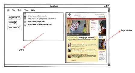
Our concept changed the way and format the bookmarks were displayed to the user. It also saved more than just the URL, in the case of the history function; in addition to the information saves it added a screen shot of the web page. Finally, the 'save and quit' function of our design does not just save the URLs in the tabs but displays a screen shot of the pages within the tab-windows.
PROTOTYPE (1st Iteration)
VIDEO PRESENTATION OF 1st ITERATION
This is the presentation of our first iteration design before we tested it. | Click to see video
USER TESTS
HOW THE TESTING WAS DONE?
We tested our design using simple sketches with the aid of a sketching software. We used this software in to help get a more realistic feel to our design (to get as close to the real design as fast as possible). With the aid of the prototyping software, it was quick and easy to alter mistakes.
One team member volunteered to be the facilitator of this user testing. Our goal for this testing was to improve on our initial design and develop a better one (according to the users) from the results of the tests.The team decided that the task for the user would be to; (a) look for a previously visited URL/web page and (b) send the link to a friend. During the testing, we used the 'think aloud protocol'. We tested two friends of ours and a faculty member. The facilitator took notes and asked questions while he observed the participant.
Overall, we tested 3 participants. The following is a summary of the data we found after user testing.
Participant demographics:
- intermediate user, male student
- advanced user, female faculty
- intermediate user, male student
User Issues identified:
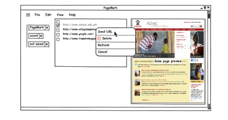
- Options that help a user send URLs were not obvious. The user had to right-click to get the options.
- It was not clear where the 'PageMark' page was opened (whether a new window/ a new tab).
- The hierarchy of the items in the first column (from the left) was not properly represented.
- The different columns in the window were not labelled, this caused some confusion.
- The names of the group of URLs in the first column (from the left) were not something the users were familiar with.
- Drop down menus were not clearly indicated.
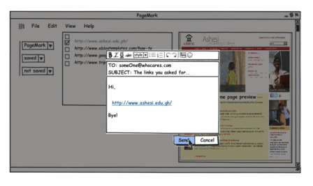
- The user was not given the chance to choose how to send the URL; the default email service on the computer was used.
- The refresh option which was part of the list was not useful.
- PageMarking/saving a page was not easy since the 'PageMark' button almost always took the user to 'view PageMark'.
- There were no hints to the user to indicate that from the address bar, URLs can be send to a friend without manually 'cutting and pasting'.
- Some users preferred to have the URLs grouped in order of the days visited rather than 'saved and not saved'.
(SCALE: 0 TO 5, 0 BEING THE LEAST AND 5 BEING THE MOST)
How difficult is it to use/understand the prototype?
- 0 outof 5
- 5 outof 5
- 4 outof 5
Rate the look, feel and layout of the design:
- 4 outof 5
- 4 outof 5
- 3 outof 5
Rate the navigation and structure:
- 1 outof 5
- 4 outof 5
- 4 outof 5
Content/info categorization:
- 3 outof 5
- 4 outof 5
- 4 outof 5
We have considered all our mistakes realised from the user test. The changes from the first iteration will be implemented the second iteration.
PROTOTYPE (2nd Iteration)
 CALLOUT DETAILS
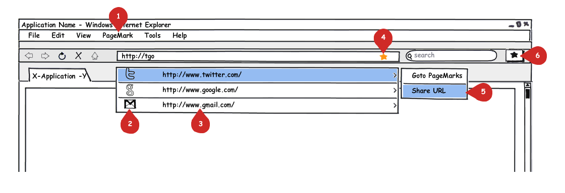
- Image 1
- 1) PageMark button
- 2) Favicon
- 3) URL
- 4) Adopted PageMark symbol from the out bookmarks concept
- 5) Short-cut to send URL to others
- 6) Alternative/ short-cut PageMark button
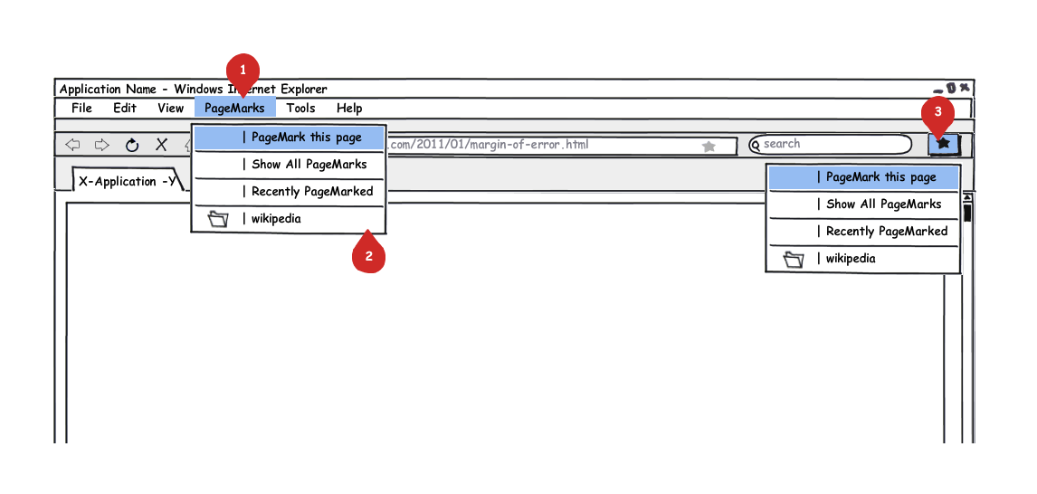
- Image 2
- 1) Selected PageMark button
- 2) One Root address in the PageMark menu
- 3) Selected PageMark short-cut button with the same menu
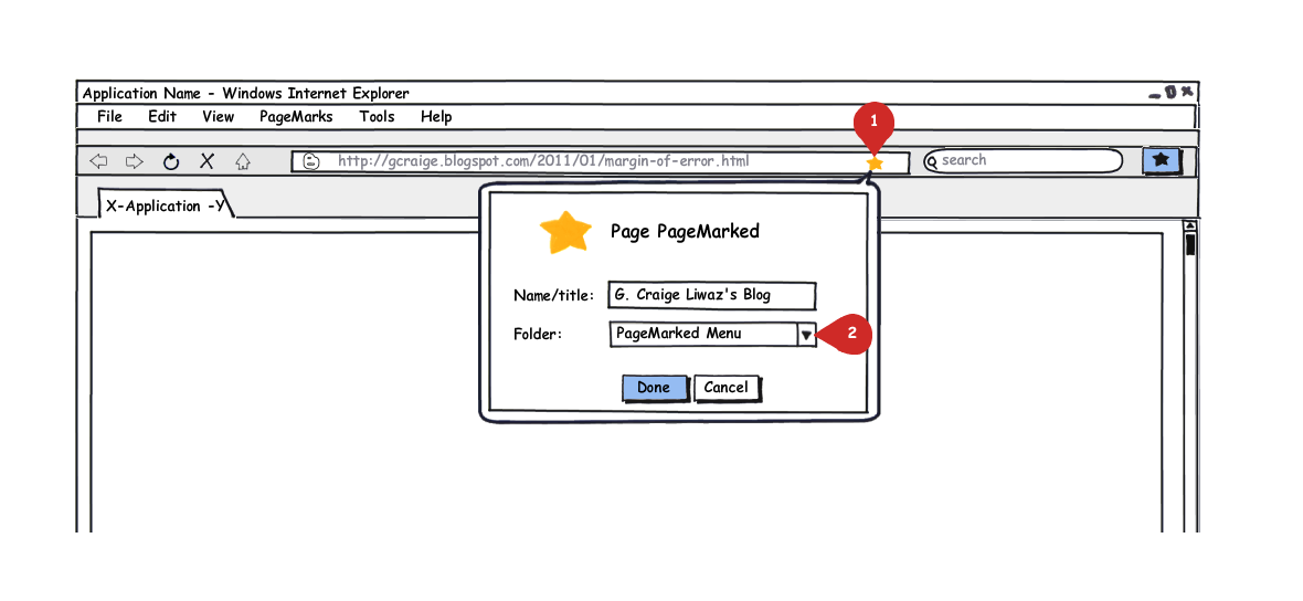
- Image 3
- 1) PageMark symbol glowing to indicate a page has been PageMarked
- 2) Dropdown to select folder to save page to
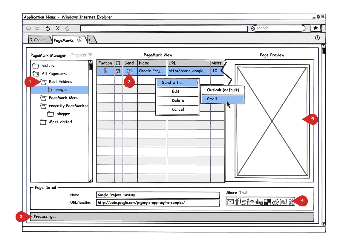
- Image 4
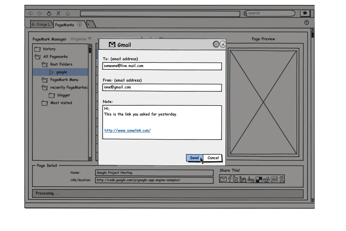
- 1) Root folder containing all root folders
- 2) Status bar indicating software feed back
- 3) Email link to send URL
- 4) Other ways to send link
- 5) Screen shot of the PageMarked page
