GraphicalMicrosummaries
Contents
UI Mockup
What's this about?
This is a proposal for a new Firefox 3 feature.
Traditional bookmarks are completely static; they're just a text label that may not even really describe your interest in the page. The addition of a favicon made things a little less bland (and gave a small usability benefit), but otherwise the basic bookmark has remained the same since the first web browsers.
Firefox 1.5 and 2.0 have made bookmarks dynamic by introducing Live Bookmarks (RSS feeds) and Live Titles (microsummaries). But even these dynamic modifications are still text based, like traditional bookmarks.
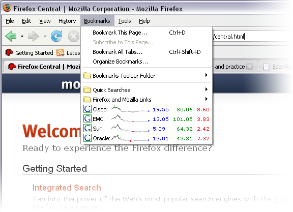
Graphical microsummaries would build upon these improvements by adding -- wait for it -- a graphical element to the bookmark entry. This allows for higher information density than plain text, and improves the ability of a bookmark entry to convey the dynamic data desired by the user. Not to mention is looks cool... Bling bling, baby!
On a more grand scale, Bug 341347 proposes allowing rich text (full HTML) microsummaries. Graphical microsummaries could be a stepping stone towards this.
Types of graphics
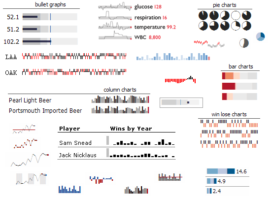
This feature would make a small number of standard, easy-to-use formats (or templates) available to the content provider. The goal is to allow the provider to simply feed in the raw data values and select a display format. For example, "show 50%,25%,25% as a pie chart in red, purple, and yellow." There may be value in providing a more low-level interface to the graphic (such as drawing individual pixels), but the immediate focus is to provide something can can be easily and rapidly adopted.
Here's a few examples of the types of graphic formats that might be available. These have been collected from a variety of online sources:
Some example use-cases:
- Stock quote chart
- Weather forecast (plot precipitation probability, icons for general weather, etc.)
- EBay bid history graph
- Sports team win/loss line
- Alternate UI for anything currently using an extension to display info in part of status bar (eg, ForecastFox)
- Tight crop of bitmap image data (eg, picture-of-the-day)?
For discussion
- Should we allow more flexibility in the graphic format -- and how much? Limited formats could result in a cleaner user experience, as ugly or inappropriate formats would be excluded. On the other hand, it's an artificial restriction that prevents capable providers from creating innovative formats quickly. Rough potential ideas...
- Implement a domain-specialized interface that makes improper usage difficult. (say, allow drawing just dots and lines).
- Allow an arbitrary image to be used (ala favicon). [More of a "graphical bookmark" than a "graphical microsummary."]
- Allow drawing access via a canvas API or SVG
- Implement some kind of data-to-graphic plugin scheme (XSLT?) so that new graphical formats can be shared. Maybe the content provider just supplies the raw data, and the user selects/customizes the display format.
- Is Vista's high-dpi display mode stuff of interest here? We might want to be able to render a graphic in better quality given the ability. (ie, discourage raster-based graphic specifications)
- How much (if any) control should the user be given over the display of the data source? For example, allowing the user to display a pie chart instead of a graph, or a week's worth of data instead of a month. To me, this primarily seems like a server-side thing, or maybe something a 3rd-party extension could expose.
- One might argue that this is abusing what GUI menu items should be used for, or what they should contain. (Does any other app do anything remotely similar?) It might be more appropriate to display this kind of info somewhere else in the browser. For example, the sidebar.
- What kind of use-cases would be helped by this feature?
XML Format
To be determined...
- Use something similar to current microsummary XML generators?
- Source data
- extract from a page
- raw data feed
- Display format
- graphic formats
- customized options (colors, range, etc)
Core notes
Implementing this type of microsummary display format would probably be done by introducing a new type of <menuitem> binding in menu.xml. (Bookmark <menuitem>s currently use the #menuitem-iconic binding, and top-level bookmark toolbar entries are slightly different).
ISSUE: Feature is dependent on platform support.
I did some experimentation with changing and expanding the binding's <content>, with mixed results... On the Mac, the application menu bar entries (ie, Bookmarks menu) wouldn't show extra images or style at all (native widget issues?). Entries under the bookmark toolbar would, though. Linux apparently works ok with changed styles (like changing the background color). Windows wasn't tested. Will need some help some people who know these areas to determine how much is possible.
It looks like custom menu entries should be possible in Carbon (OS X), although I don't really know how/if this ties into what we're doing in the browser.
The graphical part would ideally be represented by an <html:canvas> (or maybe even SVG?). I didn't have any luck with a test of that, although at worst it should be possible to have a hidden <canvas> render a data:// URL to display in the XUL's <image>.

