Gaia/Design/Patterns
From MozillaWiki
Design Patterns are core sets of interactions that are used repeatedly throughout the UX.
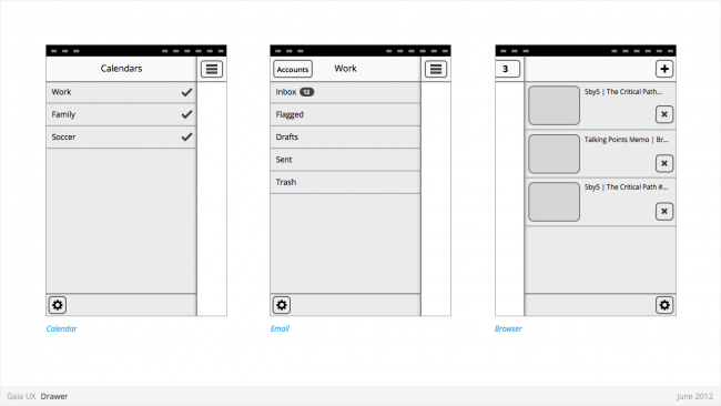
Drawer
Used for:
- Providing access to top level navigation links that may be too numerous for a Tabs pattern, or user-generated, (eg: Tabs, user accounts etc).
Characteristics:
- Provides access to top level navigation links that are usually user-configurable (eg: accounts in Email and Calendar, or tabs in Browser).
- Is also a great place to tuck secondary or power-user features, such as links to app Settings.
- Position: Should be positioned on left side of screen, but can be positioned on right in rare circumstances (eg: Browser).
- Open: should be opened via standard "Drawer" button, but other buttons can be used in rare circumstances (eg: numeric tabs button in Browser).
- Close: can be closed by tapping viewable area of the primary interface. And in future versions by swiping horizontally from bezel.
- Traditionally visually depicted as being one layer below the primary interface, and sliding in from the side via animation.
- Width: variable, but must always leave sufficient room for the "Drawer" button on the primary interface to remain fully visible.
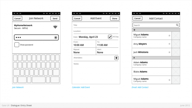
Entry Sheet
Used for:
- Editing a single setting that:
- Contains a large number of possible values. eg: Text entry forms, long lists,
- [or] Requires multipe inputs or selections eg: WiFi network connection process.
Characteristics:
- Occupies the full screen
- User should be given impression that they are on the same page, and that the Entry Sheet is merely a temporary modal overlay. They have not navigated one level deeper in the hierarchy.
- To reinforce this...
- Valid animations could include slide in from top, from bottom, cross fade, scale in, etc.
- “Cancel” buttons are used instead of “Back”.
- Every element within the Entry Sheet must be related to adjusting the single setting; Settings Panels should not contain links to other pages or lists.
- Closing:
- “Cancel”
- Varies: “Done”, “Join”, “Send”, etc.
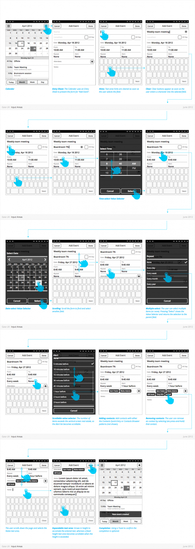
Input Areas
Multi-Select
Used for:
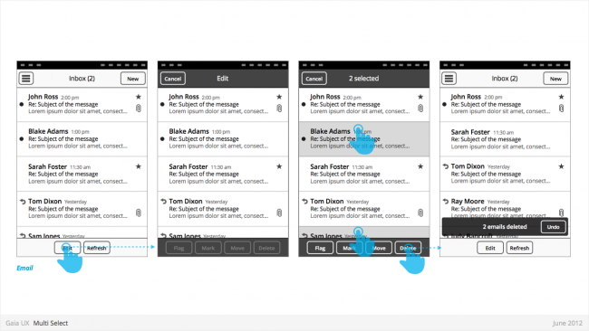
- Enables user to perform “bulk actions”, such as deleting 6 emails from a roll of 20, or selecting 3 photos to email to a friend.
- Is used on lists of items (eg: vertical list of emails in Inbox, or grid of photos in Gallery)
Characteristics:
- Is entered by...
- Is a “mode”, not a section. Animation and visual design should give user the impression that they are in a temporary mode within the original view, not that there are in a differerent view.
Can be called “Edit” or “Select” mode, depending on the use case. Header text should indicate action being taken (eg: “Select photos”). Once an item has been selected, text should update to “X selected”, where X = quantity of selected items.
- Closes once the user:
- ...completes one of the available actions (eg: “Delete”).
- ...or taps “Cancel” button.
- Closing resturns user to the previous view.
- If user has taken action (eg: delete 3 message threads), a Toast should appear, confirming the action.
States
- Normal
- Focused
- Disabled
Search
Used for:
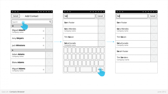
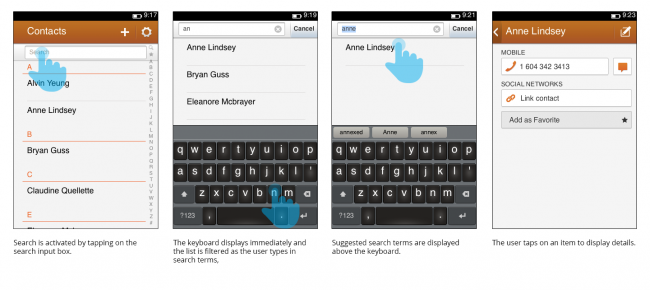
- An app can determine which content types are shown in the search results, whether they be within the app itself or online. Search can also be used to filter long lists, such as contacts (shown below).
Characteristics:
- The virtual keyboard is activated when the user taps on the search input box.
- Tapping on the (x) icon to the right of the search term clears the input box but retains the virtual keyboard
- When using search to filter lists, the search input box is typically at the top of the list and scrolls with the list items.
Settings
(in progress)
System Overlays
(in progress)
