Firefox/Projects/3.7 and 4.0 Theme and UI Revamp/Mac Specific Visual Refresh
Contents
Mac Theme/UI Refresh
The overall design changes for Firefox 3.7 on Mac are mostly the same as what is being proposed for Windows. Structurally they are very similar with a notable exception:
- The Menu Bar: The Menubar on Mac is different from its counterpart on Windows. There is no system wide push to phase it out and it is an integral platform UI element.
- App Button: Since the Menubar is not being changed this button will not be on by default if available at all.
In addition to the structural changes already proposed the Mac theme is primarily focusing on visual design changes.
Update to Visual Styling
One goal of this visual refresh is an increased amount of cross platform consistency where it makes sense. This means we have tried to incorporate similar(or even identical) shapes for items such as buttons, glyphs and tabs. The changes to make these things fit in are how they are styled and textured.
Proposed changes from the current Mac theme:
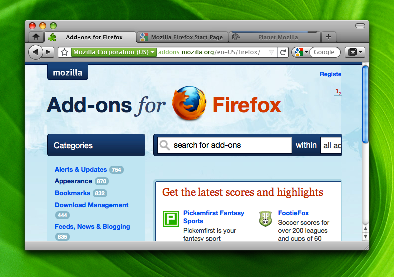
- Button Shape: Using rounded rectangles instead of the curved-end buttons found in 3.0–3.6. This will match the native button shape as well as the shape planned for Windows.
- Button Texture: Slight deviation from the current texture. Adding a slight gloss and edge highlight for some added dimension/depth.
- Removal of Bookmark Bar Texture: Removal of the glossy bookmarks bar texture for less visual complexity and more streamlined look.
- Tab Shape: Slightly more defined tabs. Also rounded edges connecting to the toolbar.
- LocationBar Shape: Use a rounded rectangle LocationBar instead of a curved-edge. This creates a visual distinction between the LocationBar and the SearchBar even though the LocationBar is still technically a search field.
Differences from the Windows theme:
- Back/Foward Arrows: Use system standard back/forward glyph shapes instead of the Windows arrow with a tail.
- Hanging Tabs: Instead of the tab attached webpage style seen in Windows we retain the hanging tabs approach from 3.0. This is the de facto system standard (e.g. Safari, Terminal, most 3rd part apps with tabs).
- No Icons on the Bookmarks Bar: This reduces icon overload and matches Safari.
Small Version
A version to illustrate how it would look with Small Icons enabled.
Personas/Lightweight Themes
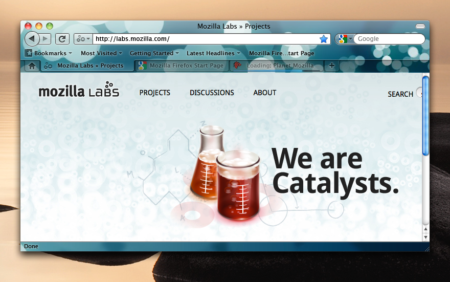
 This is an example of how the proposed changes could work with Personas or Lightweight Themes.

