Features/Mobile/Android Firefox Widget
Status
| Feature name here | |
| Stage | Draft |
| Status | ` |
| Release target | ` |
| Health | OK |
| Status note | ` |
Team
| Product manager | ` |
| Directly Responsible Individual | Madhava Enros |
| Lead engineer | ` |
| Security lead | ` |
| Privacy lead | ` |
| Localization lead | ` |
| Accessibility lead | ` |
| QA lead | ` |
| UX lead | Madhava Enros |
| Product marketing lead | ` |
| Operations lead | ` |
| Additional members | ` |
Open issues/risks
`
Stage 1: Definition
1. Feature overview
One of our User-Experience goals for mobile Firefox is to decrease the user's time-to-task. One of the things that currently makes mobile native apps compelling, compared to website/app use in a browser, is that, when you decide you want to use a particular app, your workflow to get started is the following:
- tap on the icon on the homescreen
versus the workflow for browser use:
- tap on the icon for the browser
- find the site you want, which can take one of these forms:
- bookmark taskflow
- open bookmarks list
- browse for bookmark
- tap on bookmark
- awesomebar taskflow
- tap on url/title bar
- start typing url
- tap on suggestion or hit enter when full url is entered
- bookmark taskflow
- wait for site to load
We can learn from this "quick to start" advantage of apps to improve the browser. The first step in this direction was helping users to put bookmark icons on their device homescreens ("Add bookmark to homescreen" shipping in FX9). This helps for those few sites that users care about the most, if they think to use it. We can do more for the long tail of other sites they may want, as well as for tasks that start with searching, by putting a more general-purpose browser starting point on the homescreen. By doing this, we cut out the abstract first step of launching a browser and let users get more directly to the site/app that is actually relevant to their tasks.
Given that many Android users don't know about app switching on phones (anecdotally - worth confirming?), most users pass through the homescreen to start each new browser-involving task, which puts a homescreen widget in a great position to get people right into their next search/site without making them manage tabs, etc.
Many Android apps come with a complementary widget (sometimes multiple) that a user can put on his or her desktop/homescreen. In some cases, these are put on the desktop automatically. Other widgets can be downloaded separately from the market. The idea of a separate Firefox widget points in some interesting directions, but, for the moment, this feature is seen as something that would come _with_ the browser.
See the "Design" section for a workflow of this feature.
2. Users & use cases
- User wants to search for more information about a peice of trivia she's just heard, so she unlocks her phone. There, on the homescreen, is a Firefox widget. She taps on the field and enters her search without having to first launch the browser (could the browser be loading in the background?). She can direct her search to wikipedia, and the article comes up in Firefox.
- User wants to find the phone number for the restaurant he's going to. He unlocks his phone and sees the Firefox widget. He starts typing the name of the restaurant and the site bubbles up because he's been there before. He taps on it, and the site comes up in the Firefox.
- A user wants to check her todo list, which she managed in Remember The Milk. She unlocks her phone. Because RTM is an apptab in Firefox on her laptop, an RTM icon is listed in the Firefox widget on the homescreen. She taps on it, and it opens in Firefox. A RTM tab was already open in Firefox, so she is taken to it rather than it opening in a new tab.
3. Dependencies
`
4. Requirements
`
Non-goals
`
Stage 2: Design
5. Functional specification
`
6. User experience design
There are a couple of patterns for the design of Android widgets in Froyo and Gingerbread, though also a lot of custom designs; in Honeycomb, there are more forms that are more standard. One issue to resolve is how the tablet version of this differs from the phone version. There is more value more quickly to the phone version, I think, in that users seem more likely to pass through the home screen before each new task (i.e. app switching is less well known).
Phone Design
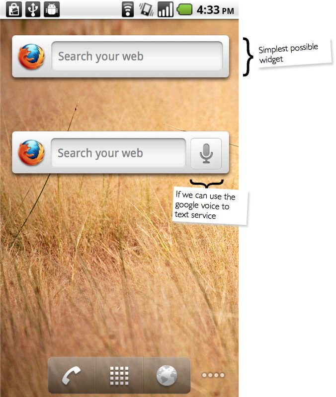
The following are two variants of the simplest possible Firefox widget, depending on whether we could tie in voice control.
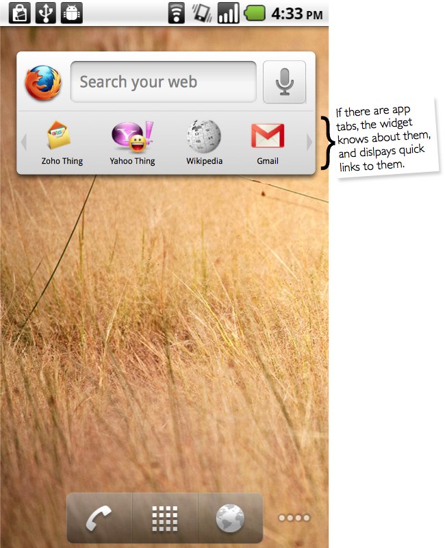
A further possibility is that the widget could be host to icons for sites that the user has designated as apps in Firefox on the phone and/or on other machines (they'd show up here via sync, in that case). This set could also include icons for installed web apps, if we don't want to put those directly on the desktop.
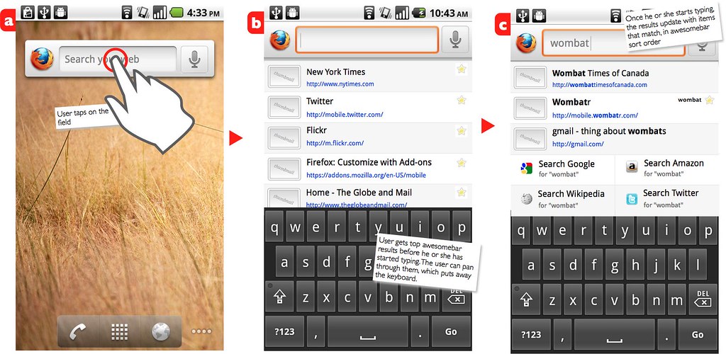
The following in the task flow for using the minimal version of the widget. In all cases, including the variant with app icons, tapping on a link to the web will bring up the tapped site in Firefox.
[mockup goes on for a bit horizontally >> ]

tablet variant
- TDB!
Stage 3: Planning
7. Implementation plan
`
8. Reviews
Security review
`
Privacy review
`
Localization review
`
Accessibility
`
Quality Assurance review
`
Operations review
`
Stage 4: Development
9. Implementation
`
Stage 5: Release
10. Landing criteria
`
Feature details
| Priority | Unprioritized |
| Rank | 999 |
| Theme / Goal | ` |
| Roadmap | ` |
| Secondary roadmap | ` |
| Feature list | ` |
| Project | ` |
| Engineering team | ` |
Team status notes
| status | notes | |
| Products | ` | ` |
| Engineering | ` | ` |
| Security | ` | ` |
| Privacy | ` | ` |
| Localization | ` | ` |
| Accessibility | ` | ` |
| Quality assurance | ` | ` |
| User experience | ` | ` |
| Product marketing | ` | ` |
| Operations | ` | ` |

