Drumbeat/website/feedback
From MozillaWiki
Your feedback on Drumbeat page designs
Please share your ideas and suggestions on the latest Drumbeat page designs here!
Feedback from Nov 9 Community Meeting
Strengthening connection between people & projects on front page
- Changes to "featured person" space
- Gina: in "featured person" space, instead of just saying they're "coming to the festival," add a project they're working on
- e.g., In current "Amber Mac" space, change to: "Amber Back is working on a project to help girls get into tech for the Drumbeat Festival"
- Could add small person profile pics next to "Project Ideas" on front page
Consider adding a "Drumbeat Blog"
- Tell the Drumbeat story in a curated way, highlighting the best new projects and people, success stories, etc.
- Provides a useful alternative to "about" for some visitors; many now click on blog to get a sense of what the overall project is about.
- Also a strong potential traffic booster post-launch. Tie in events making news (e.g., a high-profile crack down on bloggers in China, or completion of new broadband cable installation in Africa, or high-profile privacy complaint or scandal) with Drumbeat people and projects.
Translation / internationalization
- Consider the strategic implications of this pre- and post-January launch
Map designs back to Drumbeat strategic goals & metrics
- Gillian: make sure the page designs adequately reflect the overall project goals and success metrics
Feedback from Jamey Boje:
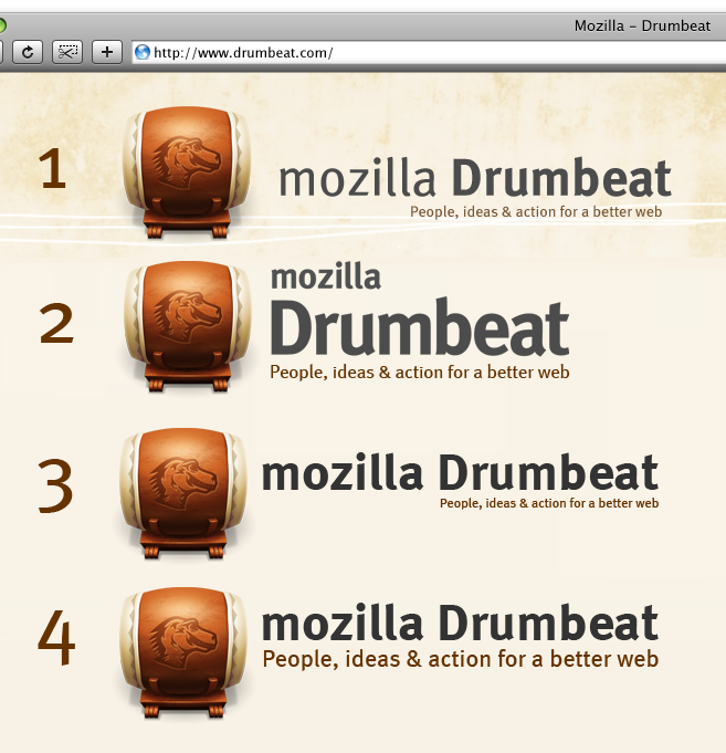
- i'm not feeling the header or wordmark (suggested improvements below)
- the top fold on the page should have more information. its going to be a lot of scrolling to navigate around the site
- for the most part the style and colors are coming around
